Case Study – Appian Vendor Management
Government contractors often face the challenge of managing vendors, with manual and time-consuming communication across various channels. Moreover, the requirement for secure document validation and strict deadlines can present further obstacles.
Type
UI/UX
B2B Web application
Role
Lead UX Designer
Time
Sep 2021 - Feb 2022
6 Months
What is the acquisition process?
The acquisition process within the U.S. government, whether it's federal or local, is incredibly tedious and confusing. Of all the Subject Matter Experts (SMEs) that I interviewed, none were happy with the current set of early 2000's-level applications at their disposal.
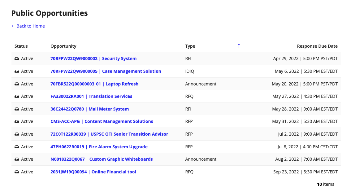
Just think of this project like a reverse eBay for government listings: if the CDC needs more printers, they'll post an "opportunity" (a listing) asking for the exact specifics of that need. Vendors will then submit proposals with their products and cost. Contractors will then select the best vendor from the bunch. Although that sounds simple enough, I promise you that the process is more complicated than rocket science.
The acquisition suite includes 5 web applications, and I was the sole and lead designer on Source Selection and Vendor Management. While I worked on VM, I also designed updates for the rest of the suite.
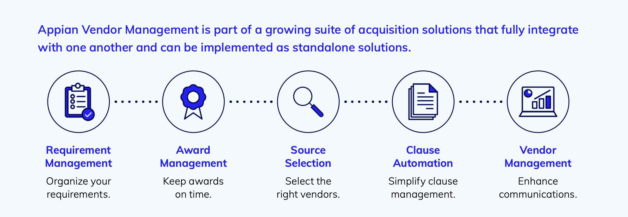
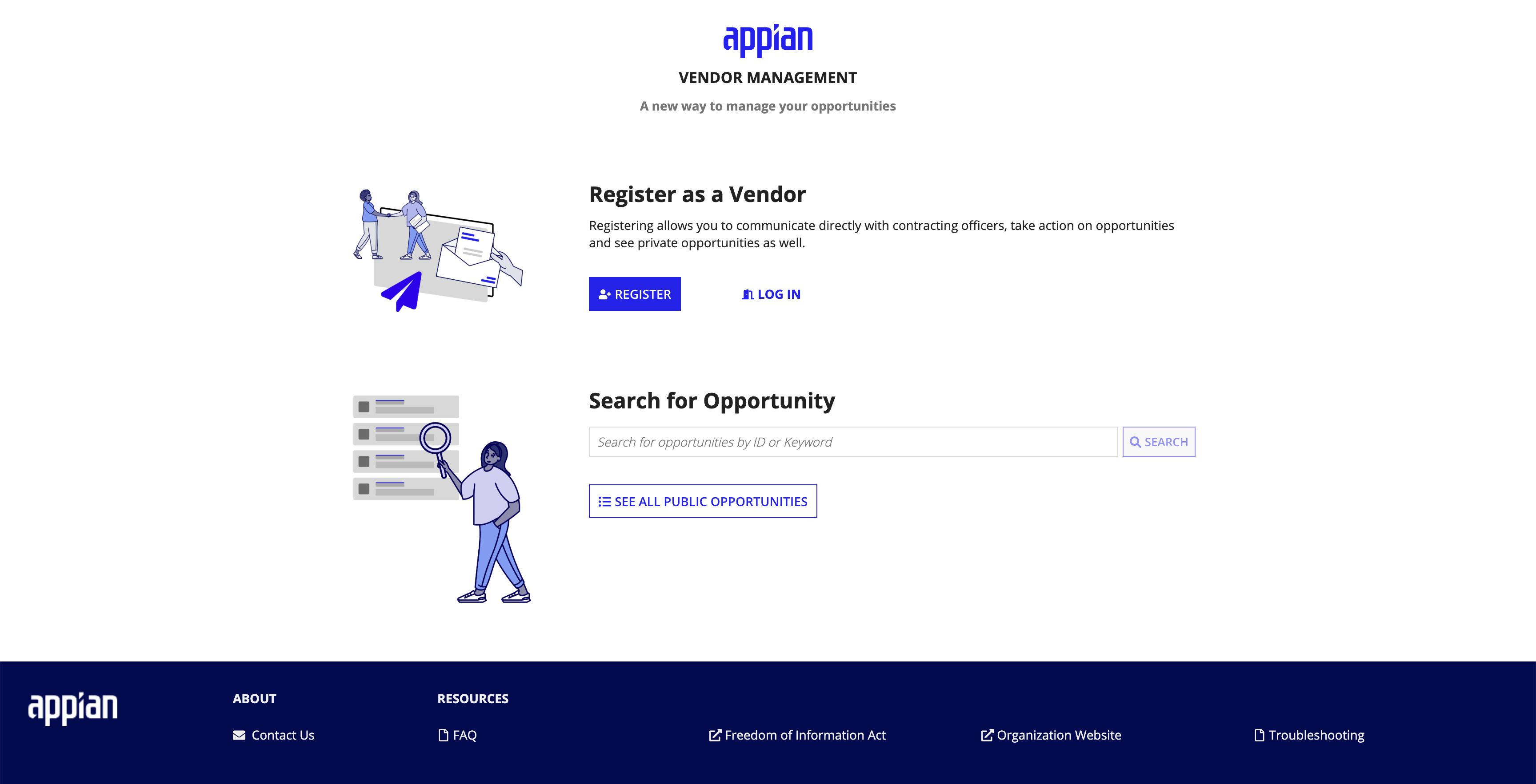
Taken from the Appian Vendor Management marketing website.
Our Goals & My Role
Our team wanted to build a standalone application for both contracting officials and their vendors, which meant the app would essentially be two entirely different experiences in one platform. This application should also seamlessly integrate with the other 4 applications within the Appian Acquisition Management Suite.
My role:
- Figure out what users are currently lacking and what can dramatically speed up their work processes
- Work with our PM to develop feature specifications
- Deliver complete design specifications to engineers and collaborate with them to meet technical constraints and UX needs
- Present ideas to the team, receive feedback from SMEs, and share learnings with the greater Appian community and UX design team
Our users
Because the contracting/vendor experiences are so distinct and yet complementary of each other, Vendor Management was essentially two applications in one. Originally, our project was meant to last only one quarter; my PM and I advocated for extending this timeline because VM would essentially be two applications in one. Our partners understood, and VM production continued swimmingly.

Vendors and Admins: look through a list of opportunities to find suitable posts in VA. Will submit Q&As and send messages to contractors to better understand contractor needs. Will submit proposal documents and, if awarded with an opportunity, manage their awards and tasks in Award Management.

Contractors and Managers: work in teams to respond to vendor questions and organize submissions. Have a ton of documents to sift through. Notify vendors of amendments through notifications and messages. Coordinate tasks and select a vendor after grading each proposal.
Competitive Analysis
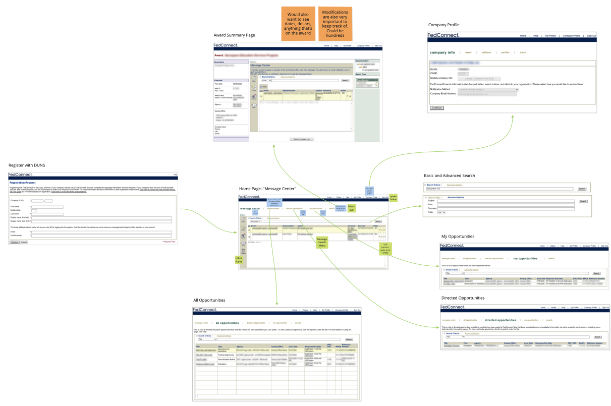
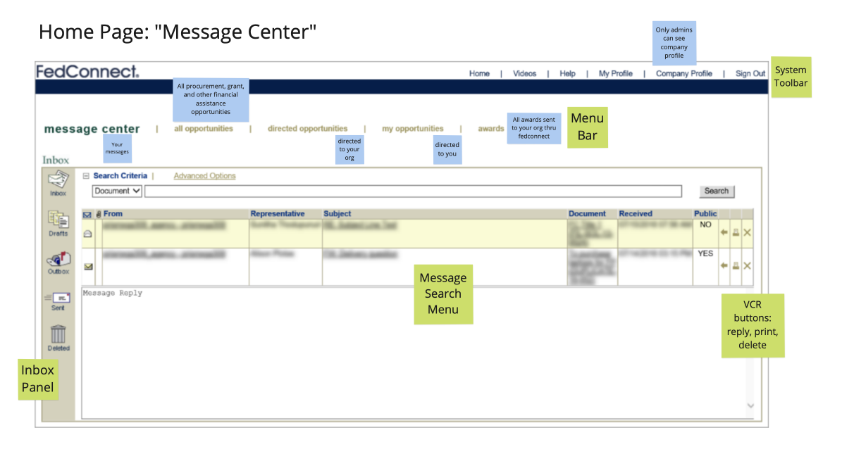
My first step after being handed this project was to familiarize myself with existing workflows for contractors and vendors. Because no one in my team had the clearance to directly interview current federal employees, I made do interviewing SMEs every week. I discovered that most of their work was done in programs like CON-IT, SAM.gov, and FedConnect, through email, through faxes and letters, and through in-person conversation and meetings.
Starting with my research, my team and I planned to address the many issues that SMEs had with their existing work experience.
Solution
Before our product even launched, government agencies rushed to subscribe to Appian Vendor Management just from witnessing our prototype in feedback sessions. VM has been live since mid-2022 and boasts customers like the General Services Administration and the Air Force.
The official launch of VM at Appian World.
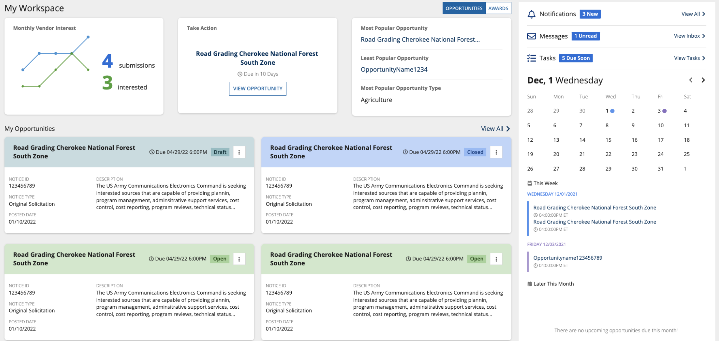
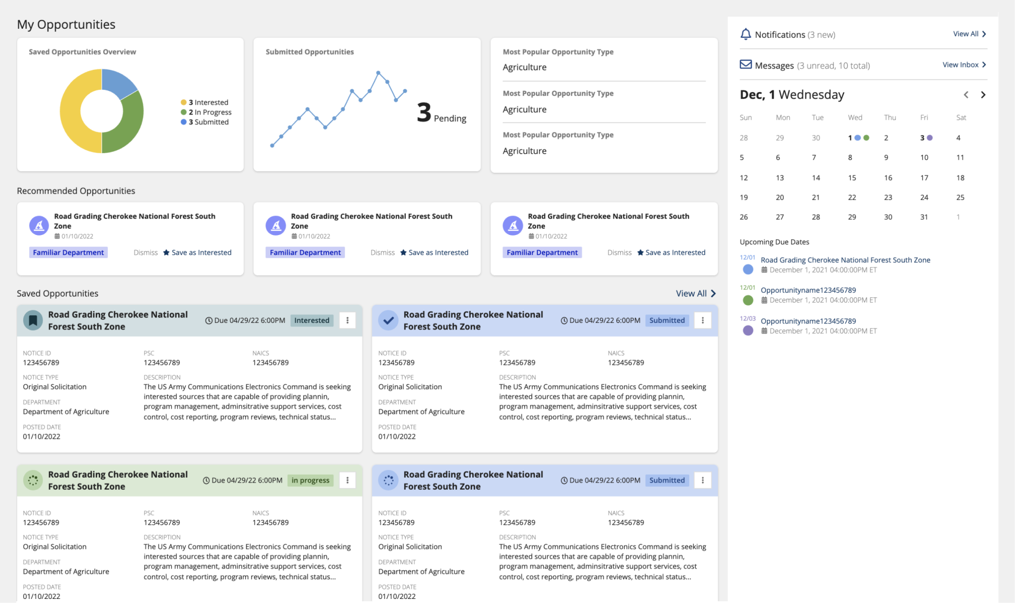
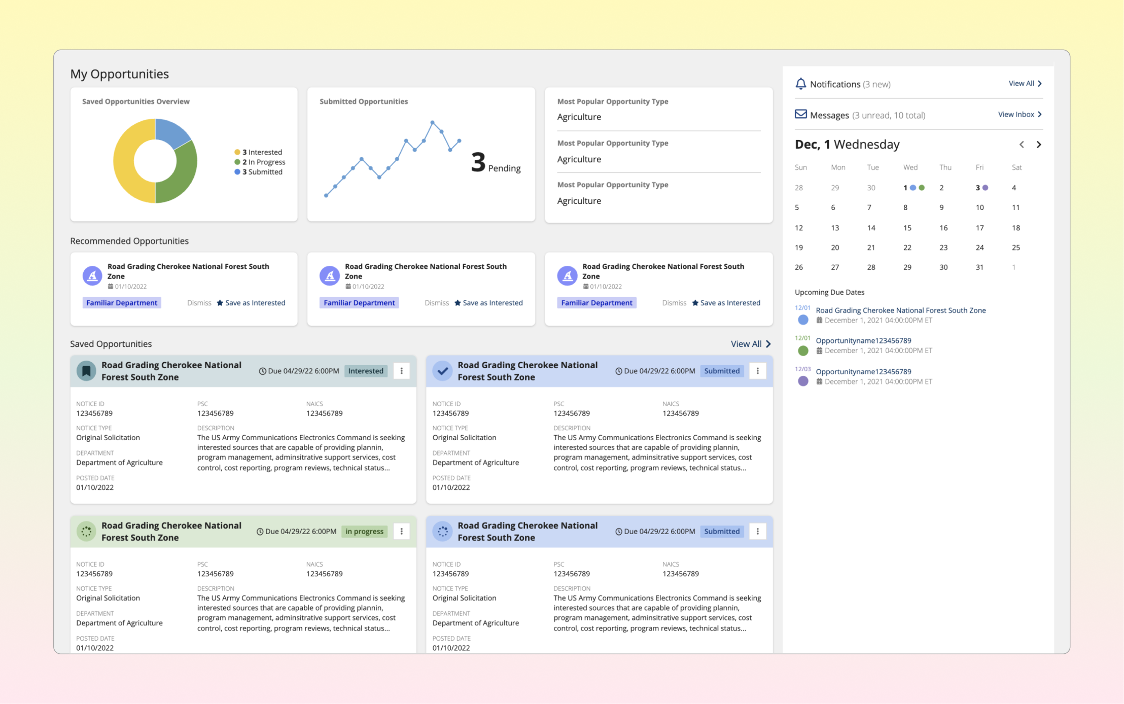
I arranged a home page with top-priority features & AI recommendations
Every single interview I conducted concluded with SMEs remarking how they have to keep tabs on what felt like a million things at once. I took the features that demanded a contractor's attention every day and placed them on a home page in according to their rank in importance:
- Vendor trends: are any opportunties more popular than others?
- Upcoming tasks and events
- Their opportunties, with respective statuses to signify urgency
- Do I have any messages, notifications, and tasks to do later?
Additionally, my PM and I discovered that SMEs craved automation: "the less work they had to do, the better". We planned on creating a simple algorithm that could recommend promising opportunities for vendors to respond to.
I introduced an innovative calendar feature that automatically filled in due dates, reminders, and meetings
This feature did not exist in any other vendor/contractor platform. Our SMEs had complained about the difficulty of keeping track of a contract's many due dates (grant submission dates, response due dates, direct messaging questioning due dates, the list just goes on), let alone multiple contracts' due dates.
I identifed the need for a calendar view and introduced this widget into our Home page for both contractors and vendors, who have to deal with their own individual key dates and deadlines. SMEs remarked that this simple and elegant solution was what they had been looking for in the vendor management process. The widget was also introduced into the Appian design library.
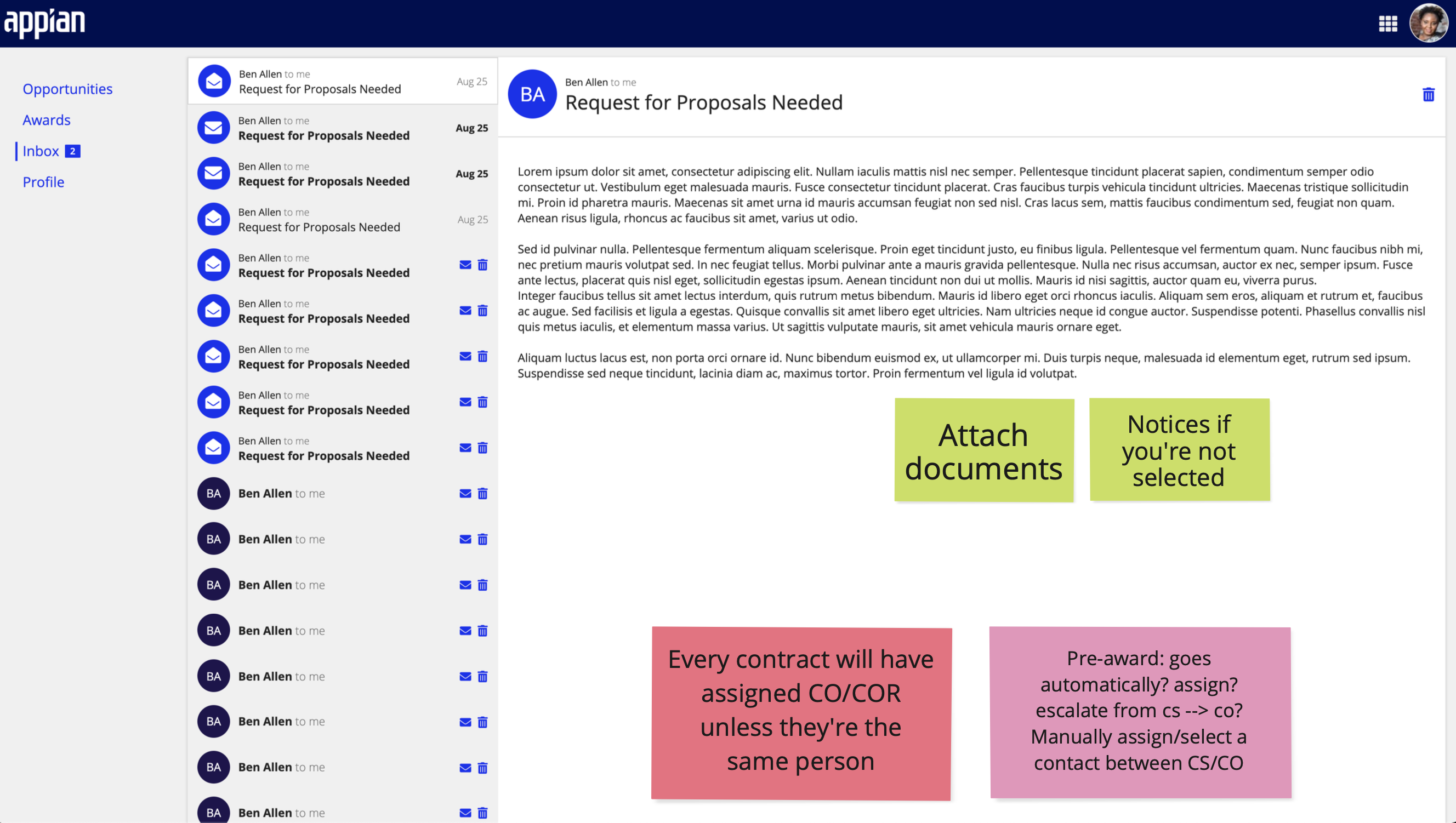
I designed a sleek messaging feature that encompasses Question & Answers (Q&As) and follows communication guidelines
Before, vendors and contractors would communicate through email, letters, newsletters, and forums. These conversations would be lost or put on indefinite pause when people would go on vacation or miss a message in a platform they don't use as frequently as others. Deadlines for submitting Q&A documents are also strict, and mistakes within the communication pipeline could cost vendors entire opportunties.
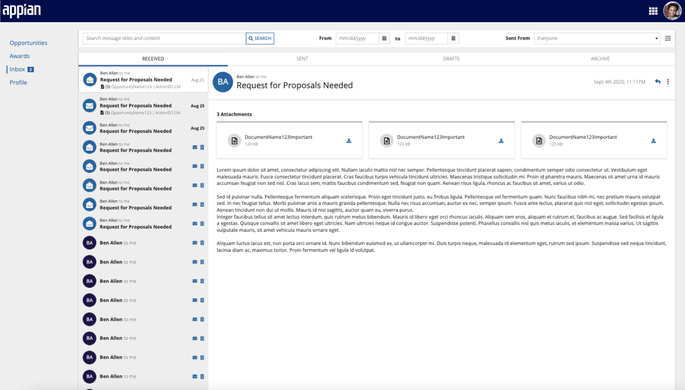
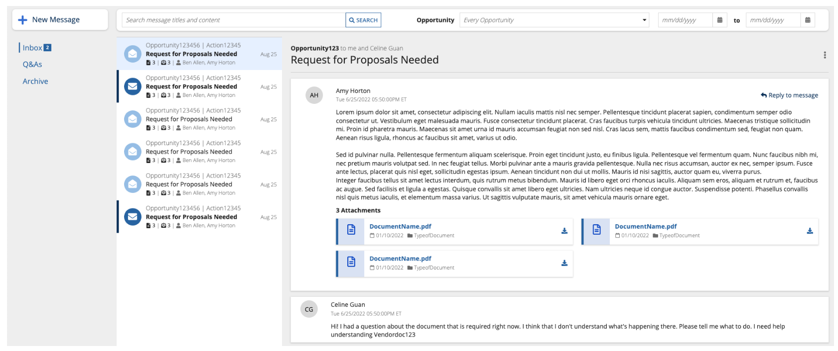
I designed a centralized messaging platform, equipped with a search feature with important parameters, like associated opportunties and thread date ranges. We also added tabs for an active DM inbox, an inbox just for Q&As, and an archive, to keep conversations organized.
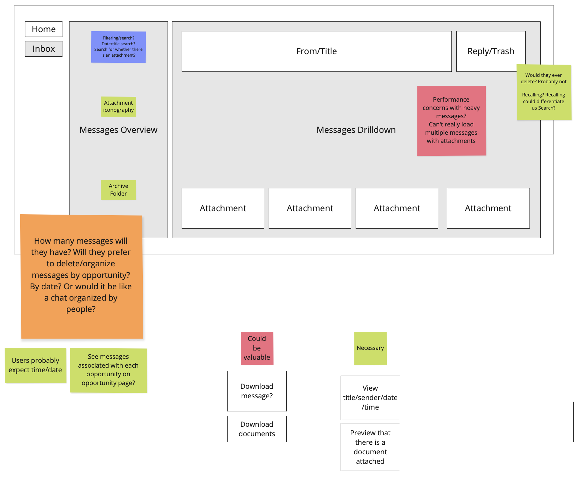
I approached this feature with incorrect assumptions at first; I initially started with a barebones existing messaging widget that only allowed one message per thread, and received useful feedback after presenting my work to a group of SMEs and product managers. I worked backward and returned to greyscales to block out my next iteration. From my early understanding of how messaging worked, I believed that contractors:
- Only needed a few attachments per thread
- Could loop in other contractors on their team to respond to messages
- Answered Q&As within regular messages
Spoiler alert: each assumption was incorrect, because I didn't have a full scope of how people worked.
After another session with our SME and PMs, I amended my assumptions:
- Only needed a few attachments per thread While both ends need to attach documents sometimes, most of their document back-and-forth will be through Q&As and proposal submissions. So, attachments aren't the most important part of a message, and can be bumped to the bottom.
- Could loop in other contractors on their team to respond to messages Although contractors do work in teams, there will be a contractor point of contact that will handle everything. Other contractors will intervene on conversations in rare instances; therefore, I needed to think of these messages less like group chats and more like direct conversations with some ghost listeners.
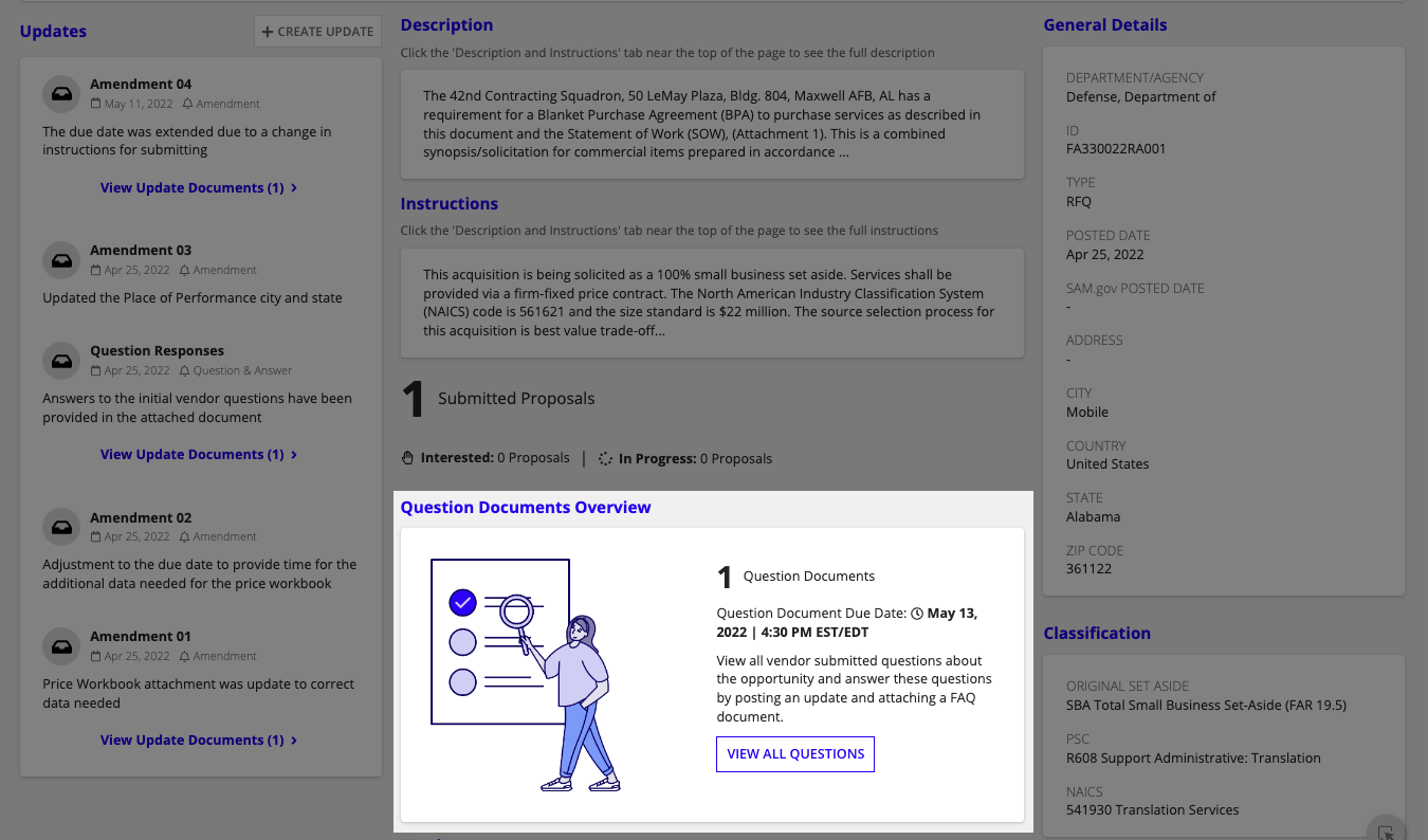
- Answered Q&As within regular messages Q&As are their own completely separate thing, and vendors will individually send one Q&A document per opportunity. I knew next steps would be to create a separate Q&A section with fine-tuned UI to best view every question document.
I then created a chat-like messaging system to address what I thought was the more direct back-and-forth user experience that our SME discussed. However, once I presented this, the team felt this was too informal, and I returned to a thread-based email system in the next round.
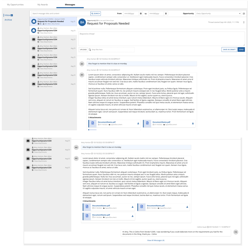
My final design addressed these amendments, and our SME agreed it felt much more intuitive than my earlier versions.
Opportunity summaries: everything vendors and contractors need to do their jobs
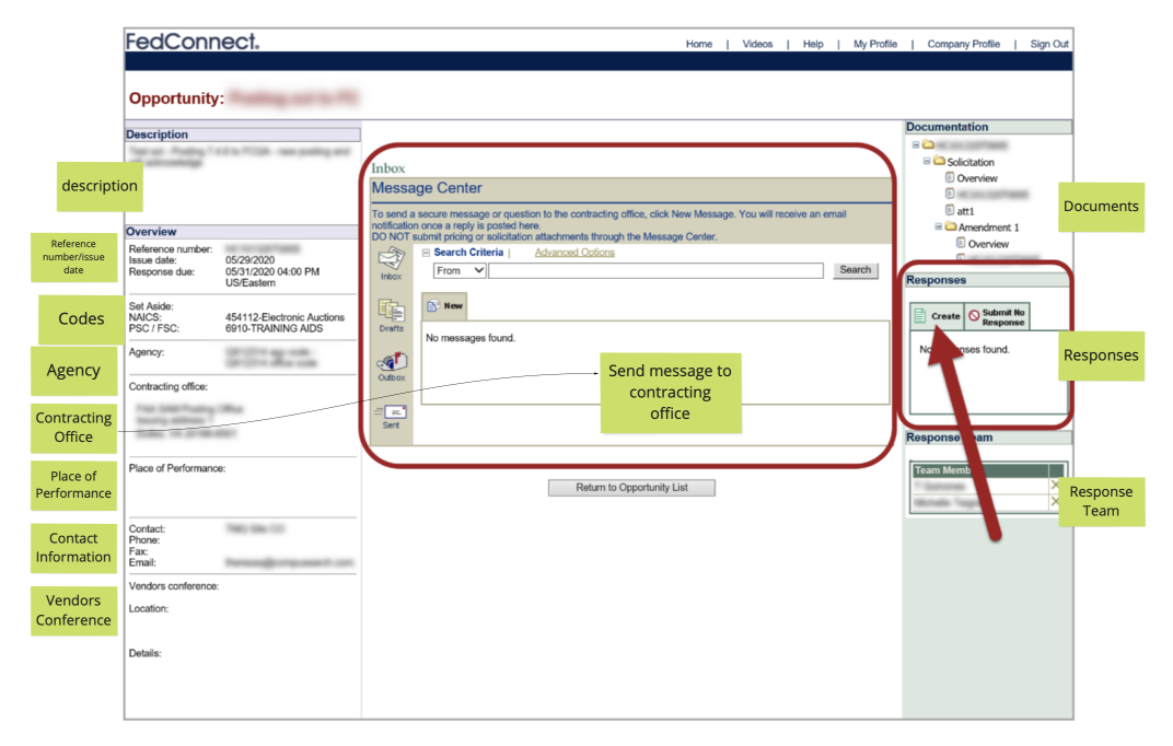
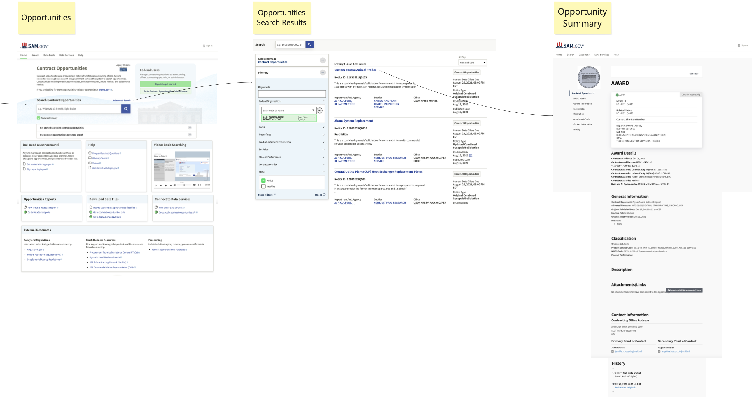
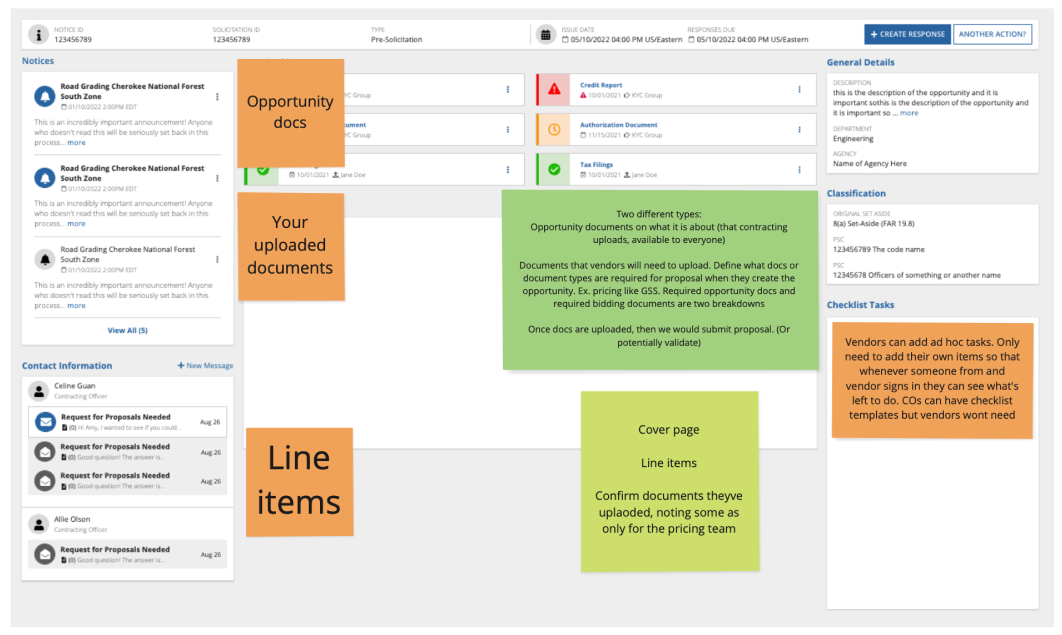
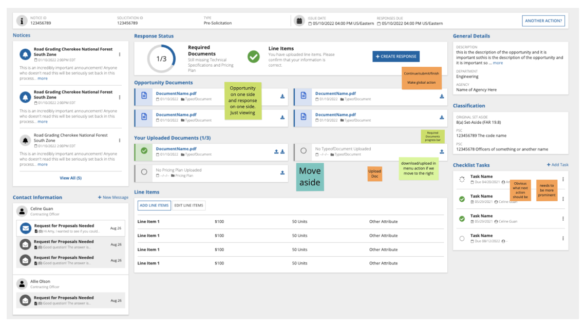
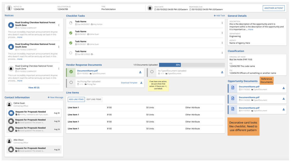
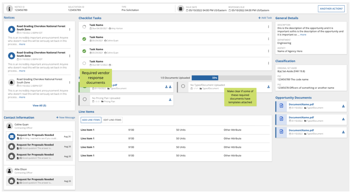
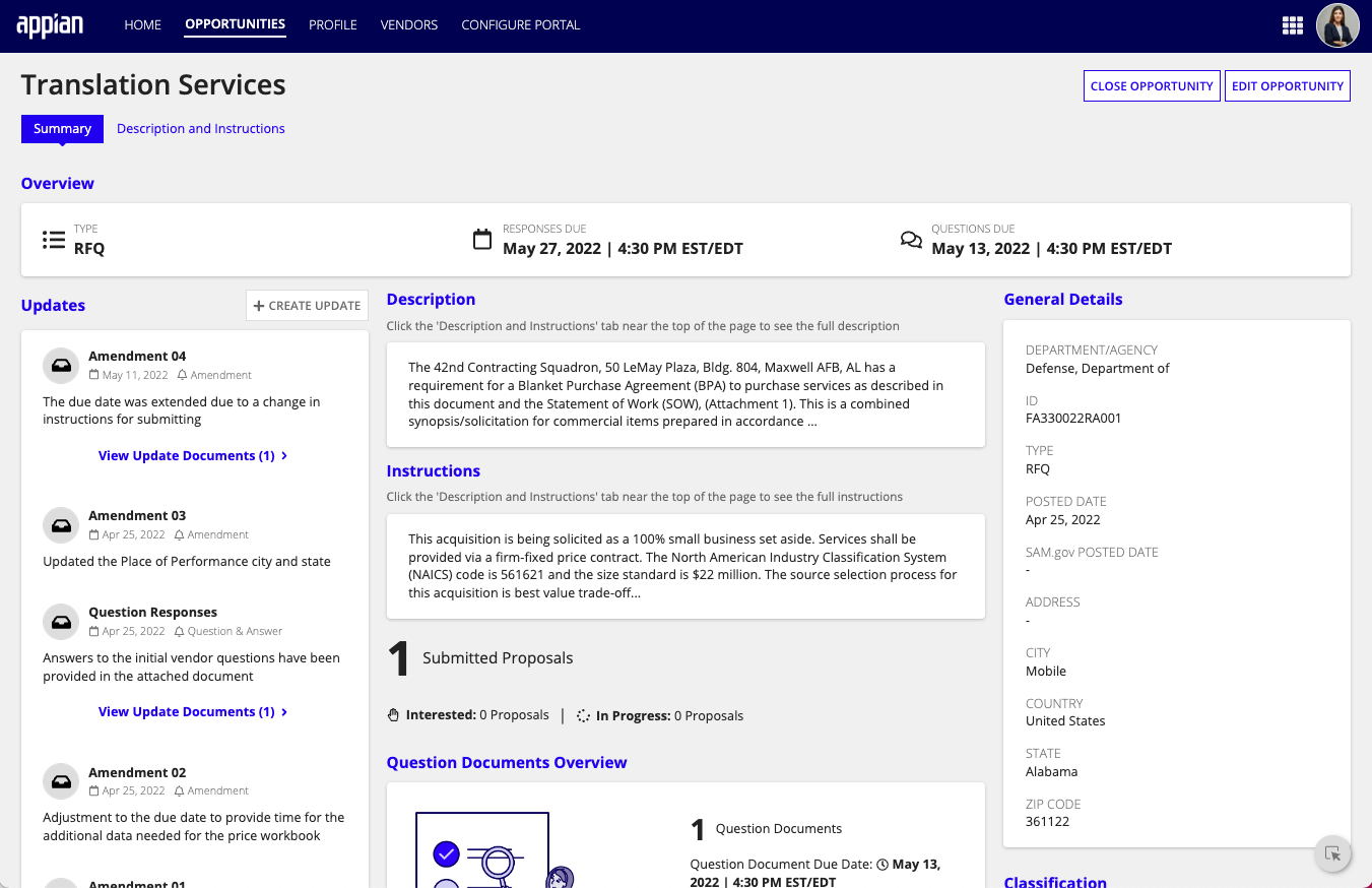
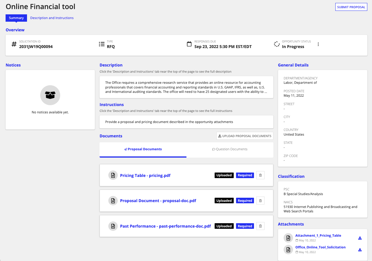
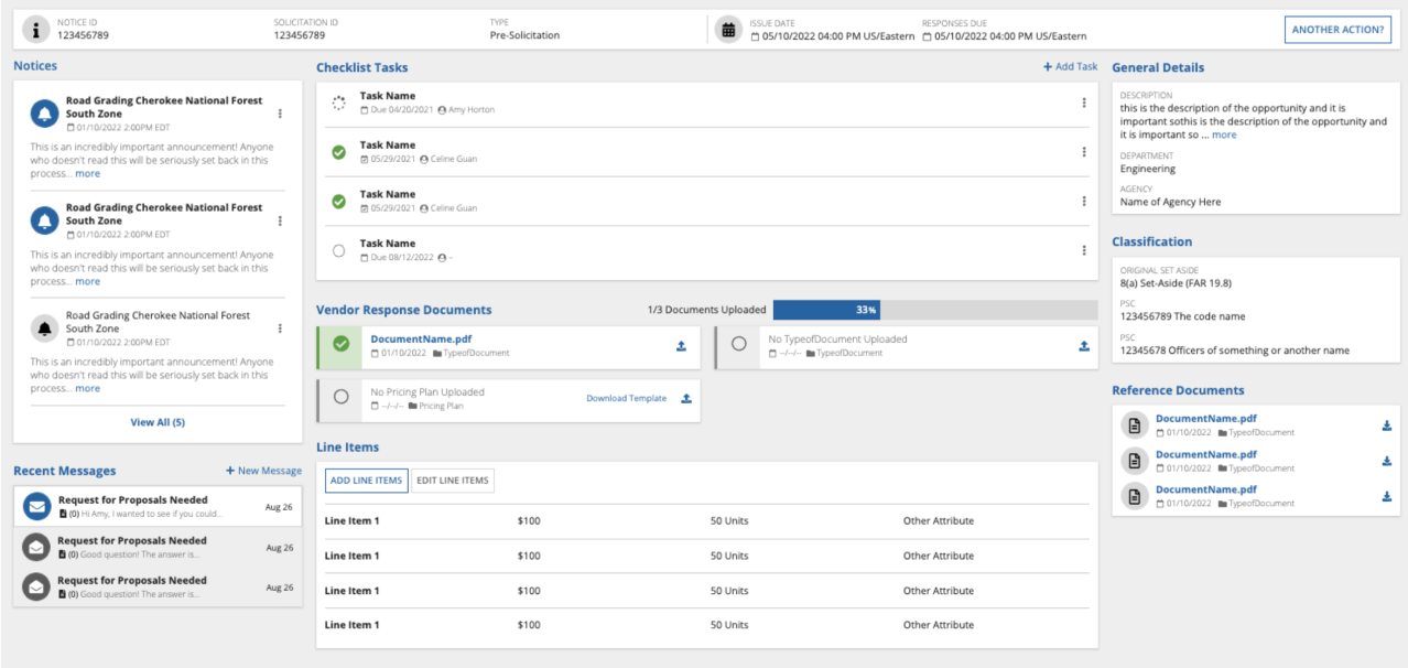
I created a new opportunity view that simplifies and organizes important details like tasks, deadlines, and notifications. Compared to the existing view (FedConnect), our design is more accessible and user-friendly. SAM.gov's interface is so long it requires around 10 scrolls to navigate.
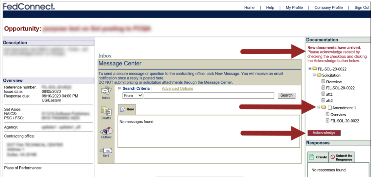
The FedConnect opportunity page encourages vendors to directly reach out to contractors. As I mentioned previously, directly messaging between contractors and vendors are very easily lost within this application because of unfriendly UX. Emailing contractors outside of FedConnect also risks the vendor's mesage being lost to the void.
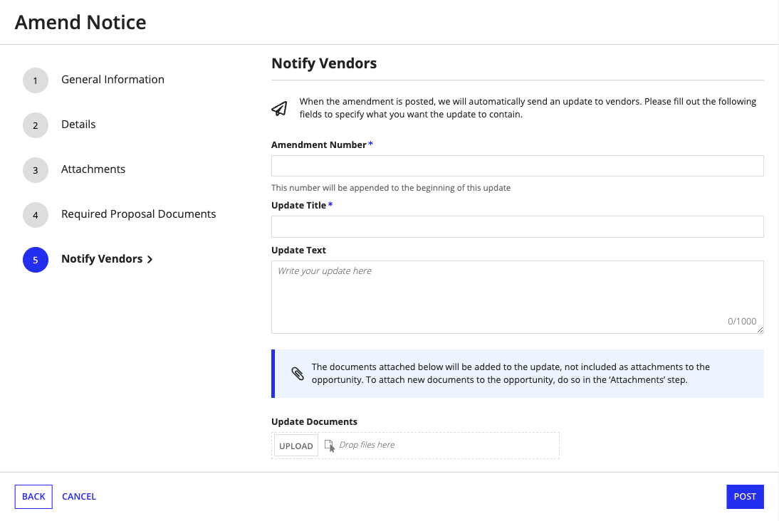
Amendments are changes to the opportunity, which come with required documents that may have different deadlines than previous documents. Our team were not aware of this necessary specification until a month into the project, so I had to pivot quickly. My PM and I designed a new notifications feature within VM that can easily alert vendors of any changes to their saved opportunities, as well as a document and task organizer.
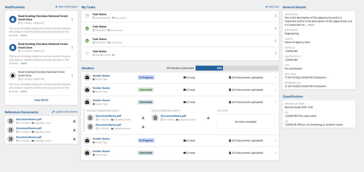
Finally, I also designed a corresponding opportunity summary page for contractors. Their key tasks are to keep track of vendors' response submissions, answer Q&As, and remind vendors of upcoming deadlines. I arranged this page in correspondence with these tasks; individual contractors can keep each other accountable with opportunity-wide tasks, view which vendors have submitted their documents, and send notifications after they update documents (the flow of which also reminds them to send out a notification after each admendment).
I received feedback in one of our final iterations that contractors like to view the final list of interested vendors and easily download a package of their documents, rather than "keep track" of a vendor's progress. Vendors were likely to submit all of their documents right before the deadline. I changed course – now, once all vendors have submitted their documents, the page would transform into a much more slimmed down dashboard that focuses on document management.
Final Product
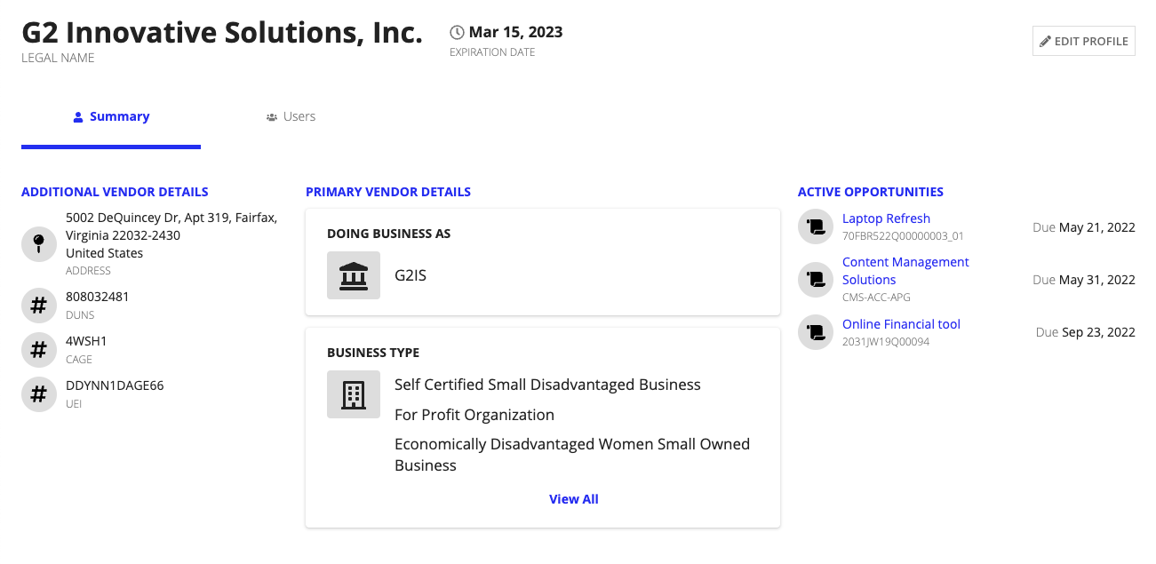
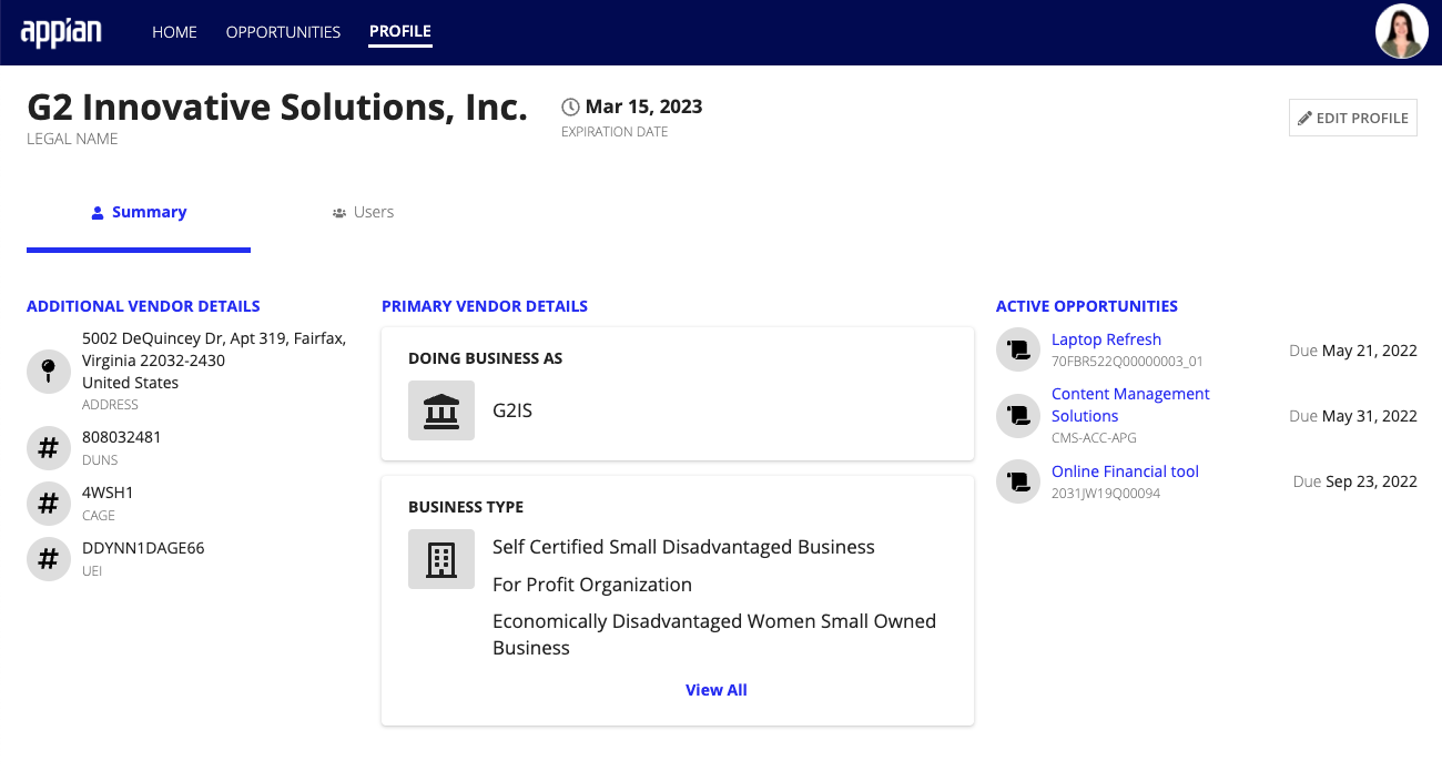
Vendor Management by Appian has become a useful tool for simplifying vendor management processes. Its centralized portal and automated document management can save time and increase vendor participation, ultimately leading to smoother acquisitions and improved outcomes.
Currently, VM is on its third version; I have not worked on it since its first release, so these pages are slightly different from when I was originally on the team. Some pages may also look different because the team is incrementally developing each feature towards the final original design.
My Takeaways/Learnings
I worked strictly within an agile 2-week sprint cycle, and it helped me become more disciplined with creating iterations every week
I became very comfortable with diving into designing even when nobody on the team felt confident we knew what was happening. Receiving useful feedback and learning from mistakes, rather than planning endlessly and trying to make the perfect first iteration, is more important to me.
I designed VM with confusing rules and bureaucratic traditions in mind. I didn't want to introduce anything too different or out of line from what is allowed for government employees, so I had to keep these constraints in mind at all times.
I learned that almost anything can be boiled down to an editable grid. If the data becomes daunting to me and I find it difficult to grasp a ton of new information, I can just easily write out a user journey or organize data components in a network or table.
