Government procurement is complicated and high-stakes, yet runs on inefficient spreadsheets and paper trails; I was the lead UX Designer for Appian's Acquisition Management Suite, which elegantly automates and simplifies procurement.
🏛 Enterprise Applications. 🖥 Web Interfaces. 🖱 UX Design.
Introduction
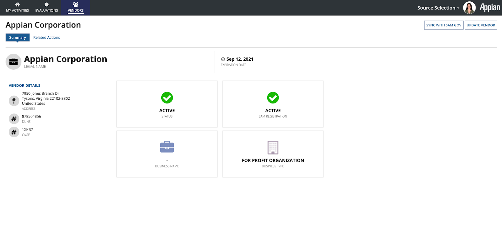
I had two main roles: first, I designed Source Selection and Vendor Management from beginning to end. Second, I created interfaces for features to add to Award Management and Requirements Management, which both launched before I joined Appian. For new applications, I spent around two months need-finding, creating personas, and conducting competitive analysis. I worked with my product managers to design the site architecture, basic user flows, and wireframes, as well as prioritize features and go over design roadmaps.
Once we hashed out the basic features and functionality of our application, I jumped into creating high fidelity mockups, testing these interfaces with subject matter experts, and iterating for another two months. The final step is designing backward from our most complex high fidelities (dashboards, reports, and summaries), and creating forms, wizards, and smaller steps to produce the finished application.
For the sake of efficiency, I will be simplifying my workflow to the following steps to exhibit a few features. Otherwise, stay tuned for full case studies coming soon!
PROBLEM & SPEC
RESEARCH
PLANNING
FINAL DESIGNS
IMPACT
Source Selection
PROBLEM
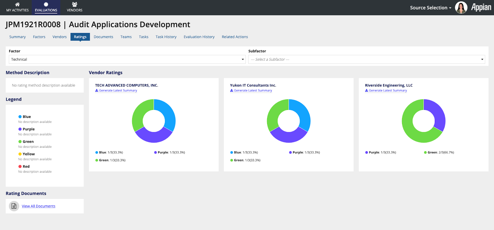
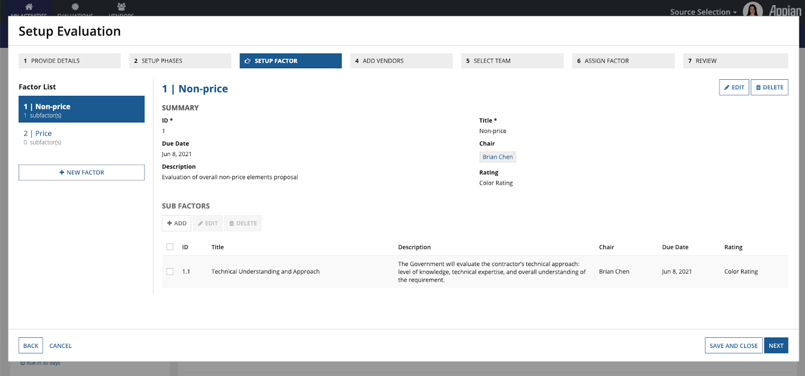
The government needs to buy things, and they have a reverse-eBay system where they'll make a post about what they need (ex. office supplies). Vendors will submit "bids" to this post that detail why their products are best suited for the job. Source Selection is a web application that allows government contractors to go through the arduous process of evaluating every vendor's proposal.
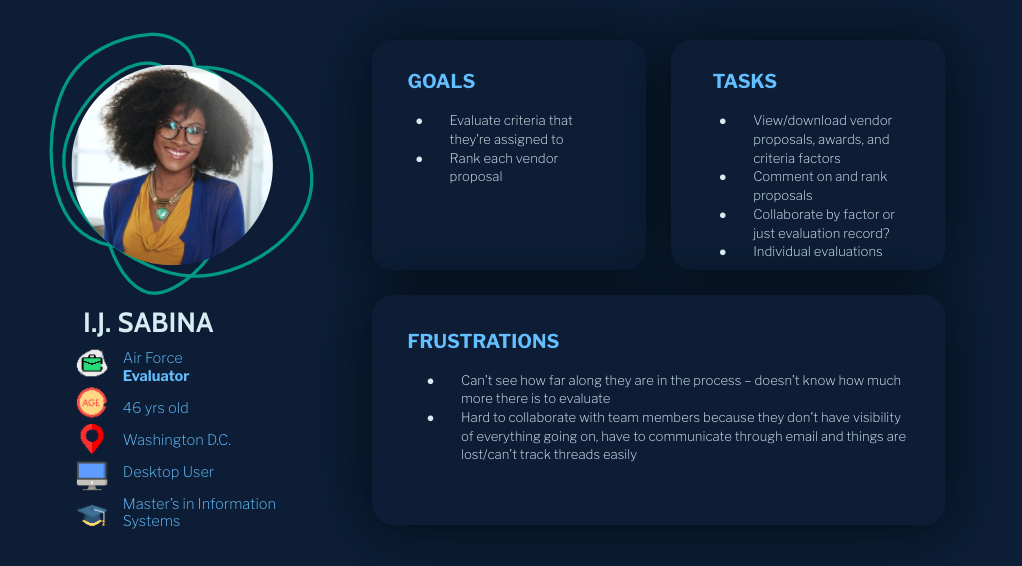
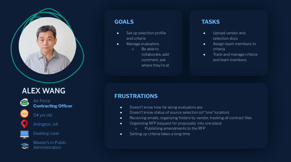
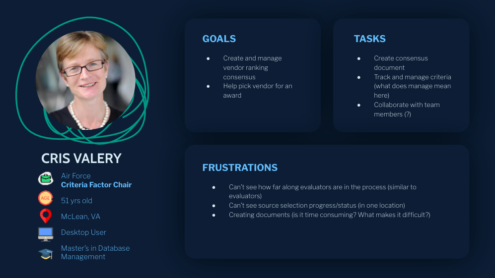
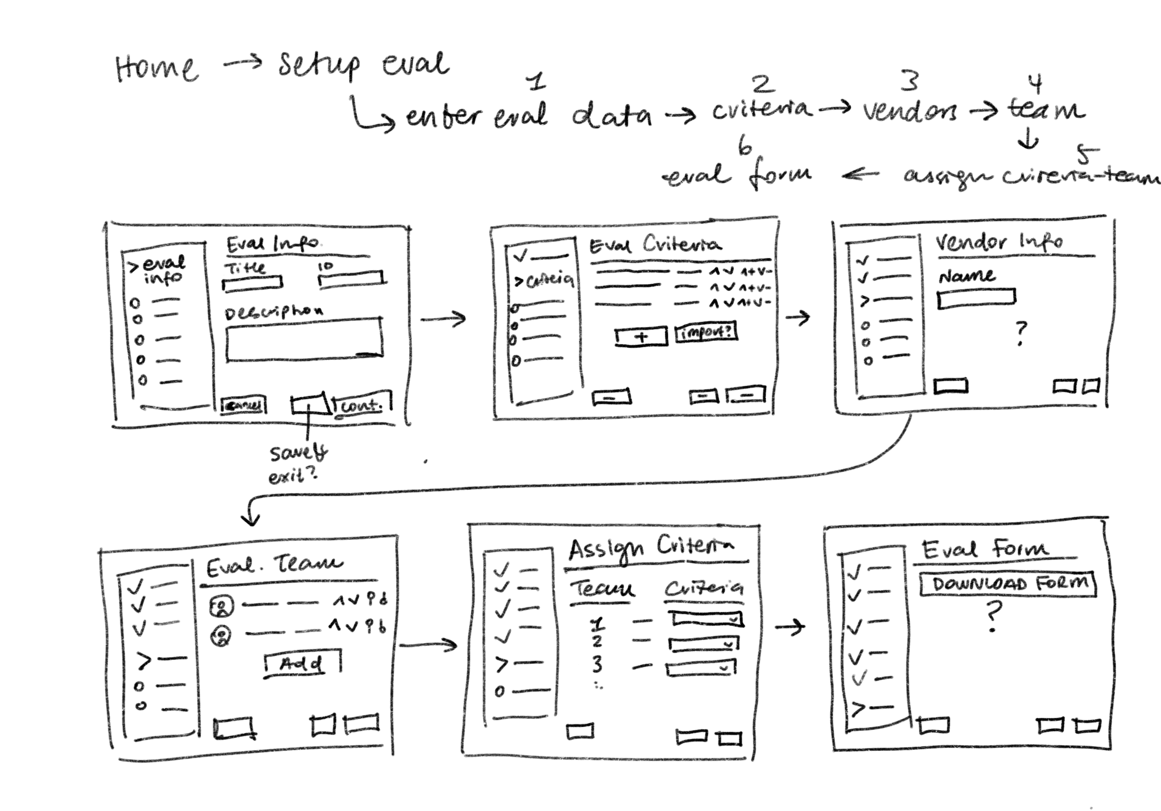
RESEARCH While I can't show every part of my design process, here is a brief overview of personas and user flows that I created after weeks of user research.
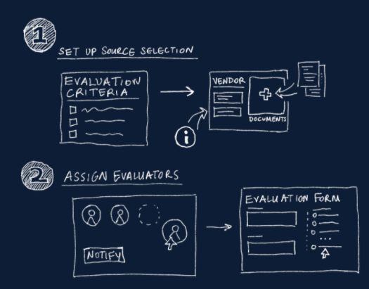
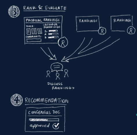
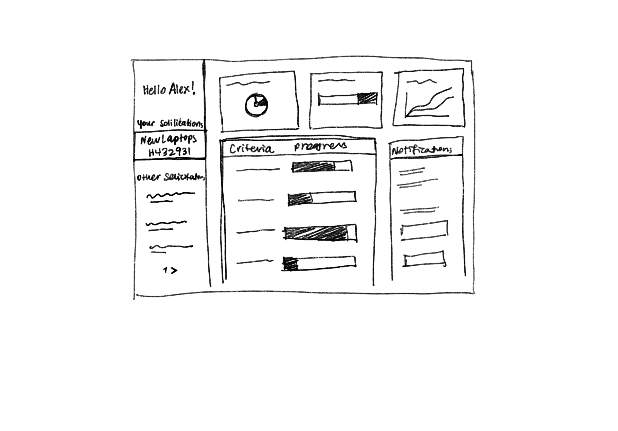
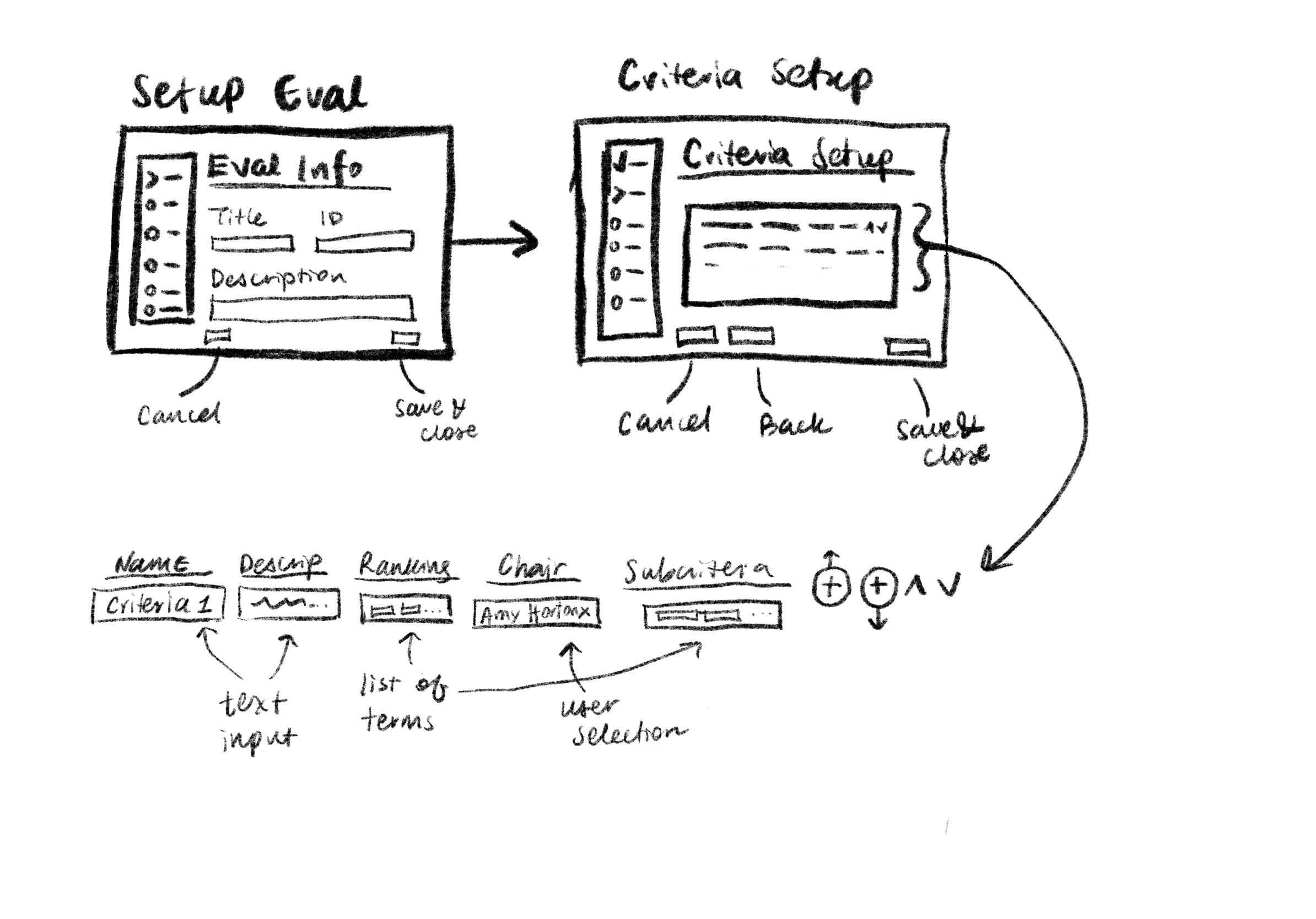
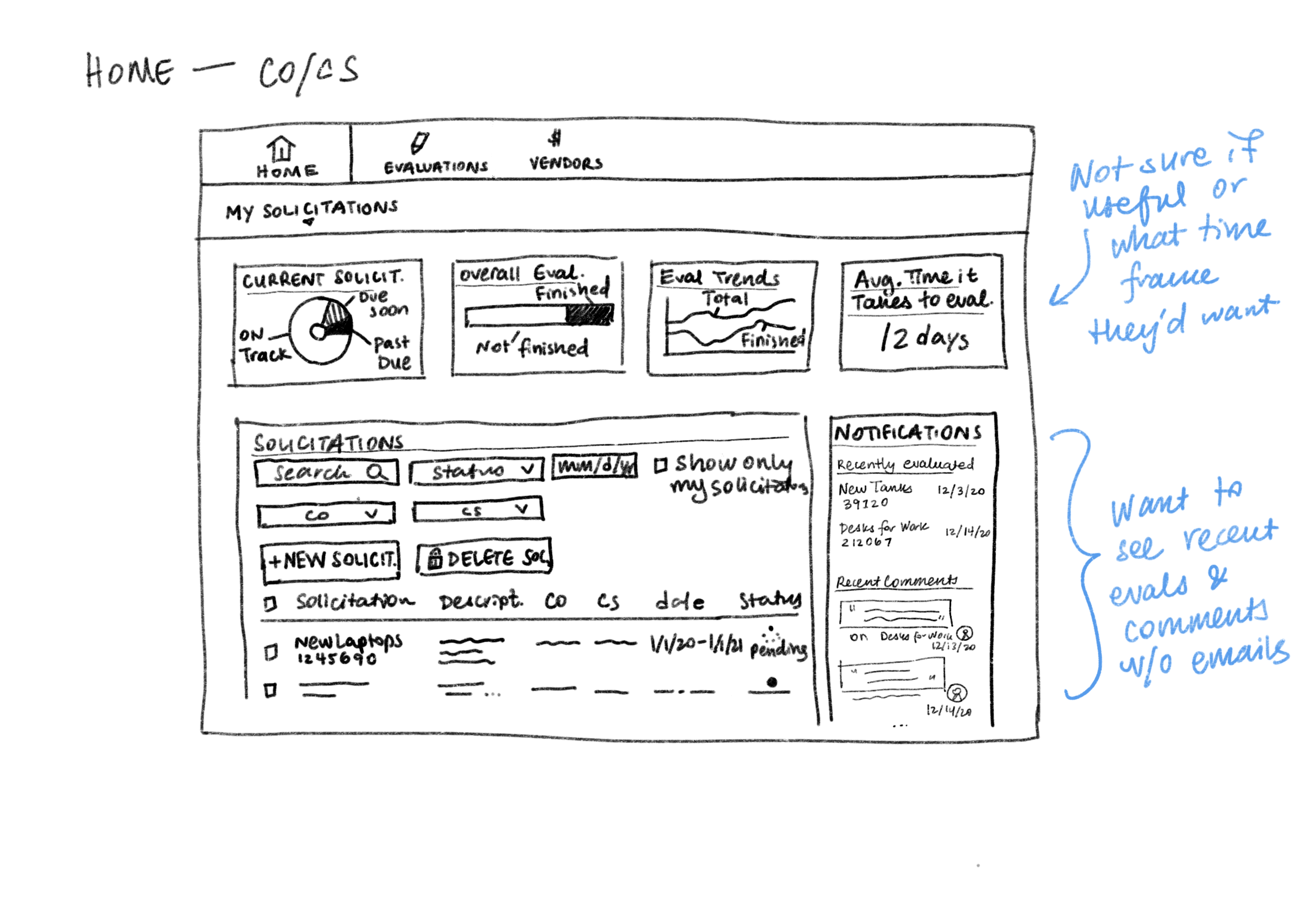
PLANNING Next, I sketched out the application to flesh out features and flows before wireframing.
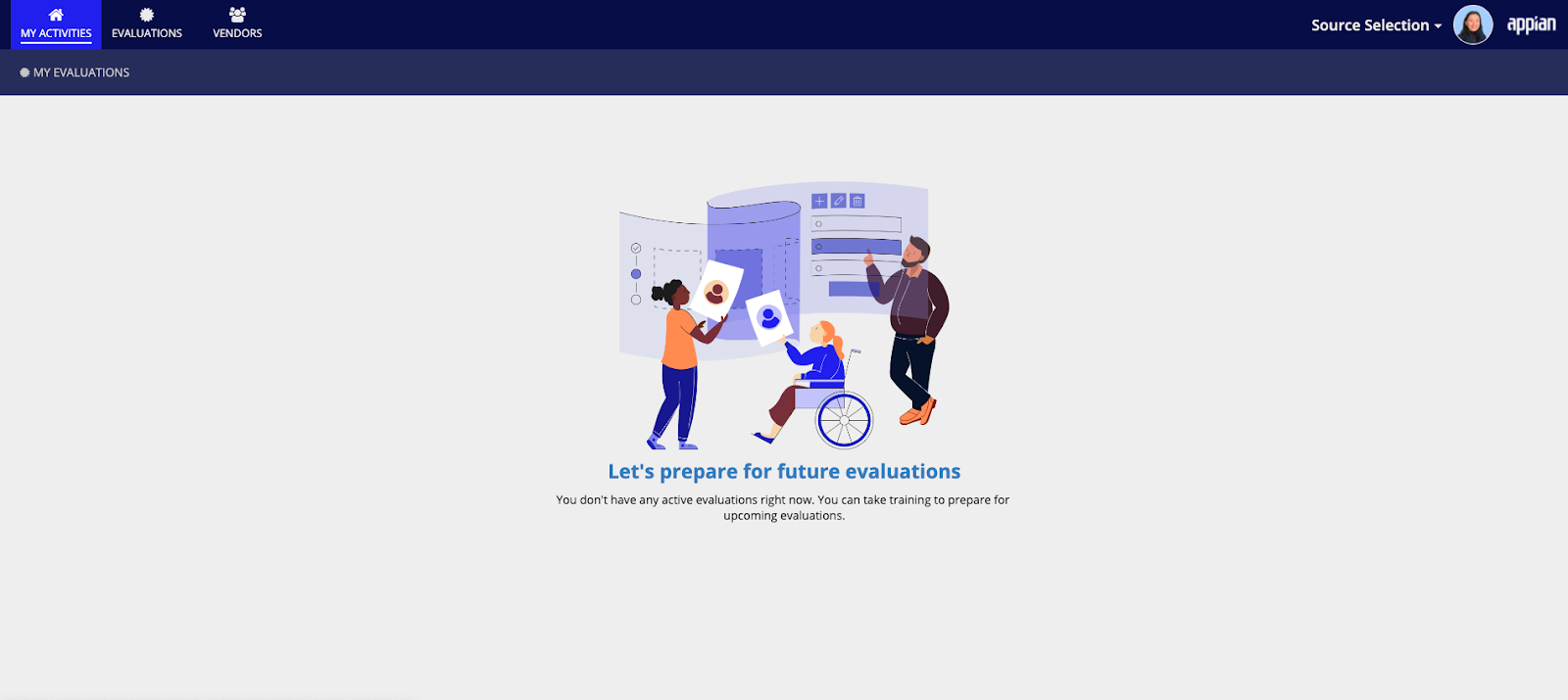
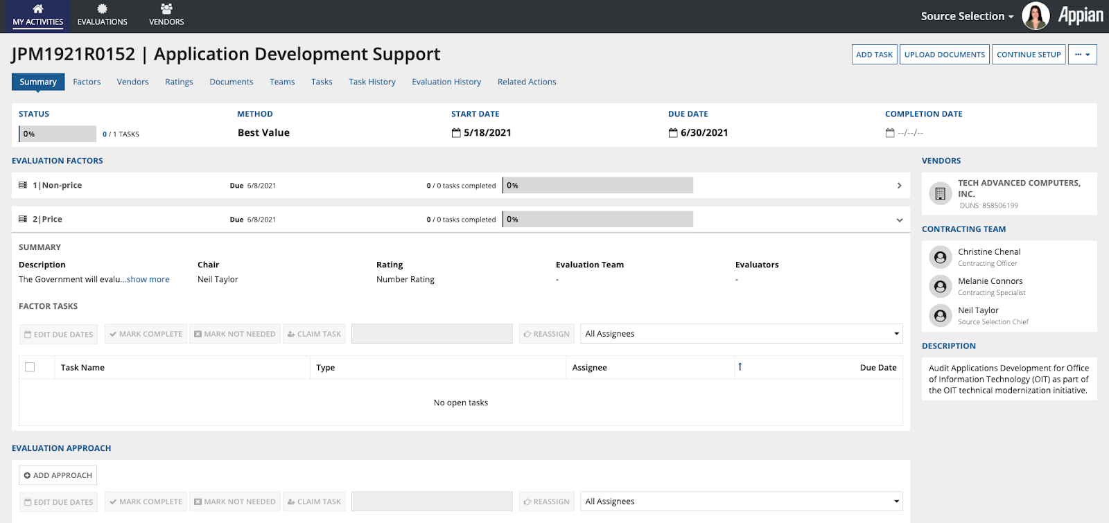
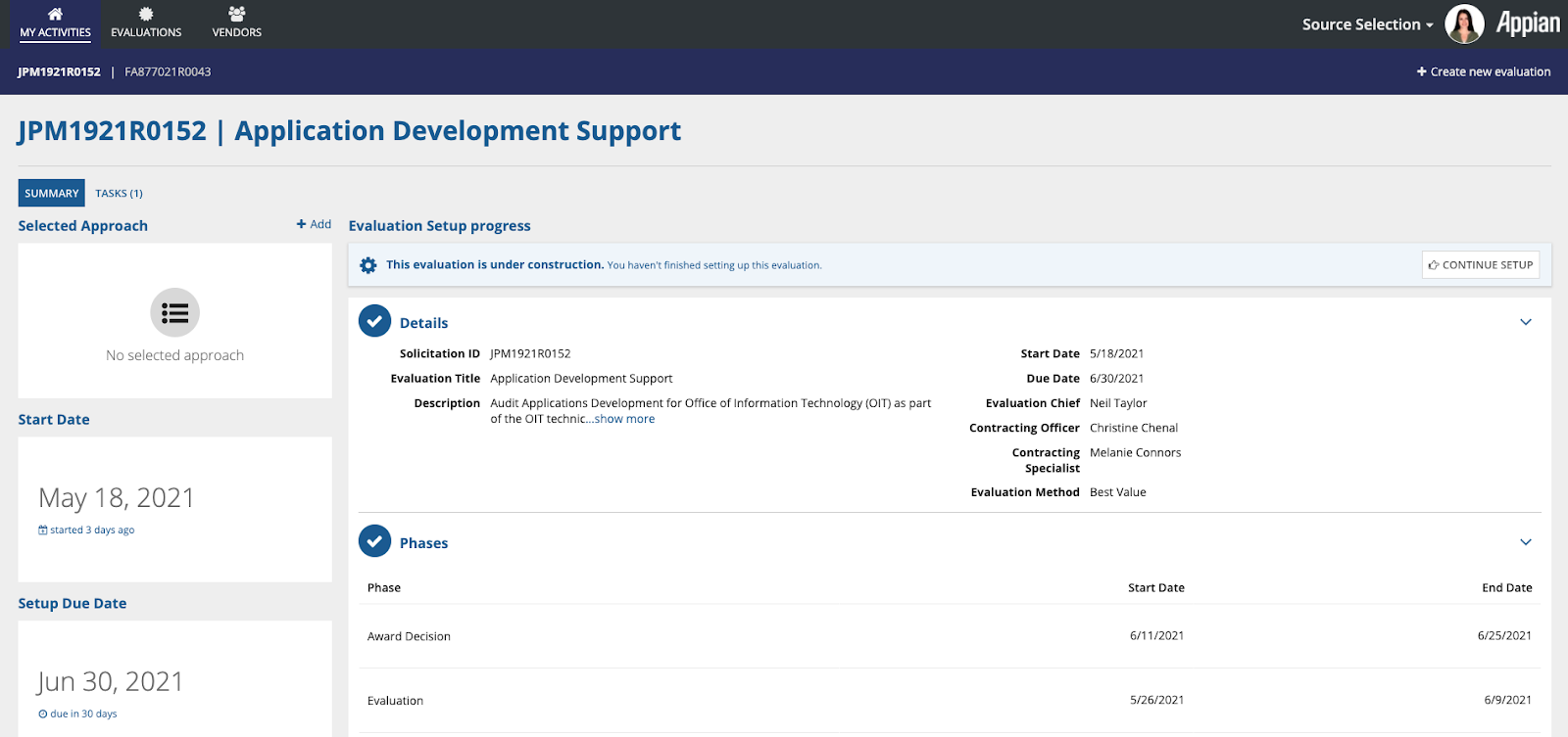
FINAL DESIGNS Finally, I created wireframes & high-fidelity mockups over the course of 3 months with my project managers and product owners. Because I was the first UX Designer to join the team, we went through trial and error in creating our lead designer role. Luckily, I had two years of experience working as the only designer on a team, which helped us efficiently figure things out. We now have a standard working agreement for UX Designers across our group! I also joined a Product Illustration guild and helped create the empty state illustration for our home page.
IMPACT Being the first designer on the team also meant that our application inhereted many features from past applications that had sub-optimal UI and UX. I lead the way in redesigning as much as I could within our short development period. My team then gained another UX Designer, Mayank, after Source Selection launched. Together, we created a design guide for future Government Acquisitions applications and started to revamp the two applications with releases after Source Selection. If you'd like to see public information about Source Selection, please check out the video below:
My Takeaways/Learnings
My role heavily overlaps with Project Managers
Became an expert in Jira/Agile
I currently manage a UX Designer & have learned to delegate more
I loved managing interns this past summer!
