College students can finally take off their masks and receive mental health peer support through Unmasked.
📱 Mobile design. 📝 User Research. 🖱 UX Design.
Our goal was to destigmatize talking about mental health and give college students the wellness support and community they need.
Teammates
Justin Luo
Eric Wang
Mira Ram
My Role
UX/UI Designer
Project Manager
Clients
Sanat Mohapatra
Unmasked Leadership
Introduction
Unmasked is an anonymous, mental health peer support mobile application for Dartmouth students. In this virtual space, students can discuss issues surrounding mental health, share their struggles, and receive support from their fellow students. I worked on Unmasked from its initial conception to its recent launch. I really believe in this product and encourage college students to check it out on the App Store!
I first conducted User Research, identified problem statements, determined core functionalities, wireframed, and created the flow of the app with Justin and Eric, two awesome UX Designers I had the pleasure of working with.
Next, with another talented UX Designer, Mira, we added trigger warnings and user reporting and banning to Unmasked's core functionalities. I also designed the logo and promotional materials to prep it for launching.
Unmasked Preview
Here is a clip I took while going through Unmasked in 2020. What you're reading here are real-life comments, thoughts, and concerns posted by Dartmouth students.
Empathize
Our initial problem statement and hypothesis was that "Mental health at Dartmouth lacks a positive and accessible discussion space. While Dick’s House – our school Hospital – functions as a resource for mental health at Dartmouth, students find it difficult to openly discuss their issues with peers who can offer support and guidance." To further empathize with our user group, we conducted user interviews, created user personas, and brainstormed.
User Research
We interviewed a diverse set of 15 students and asked them about their social media use, campus culture surrounding mental health, and personal wellness coping mechanisms.
Key insights:
- Public social media fosters an environment in which people will "fake" a more idealized life. This promotes "duck syndrome", a phenomenon similar to how ducks look peaceful while floating on water, but we do not see them vigorously kick their legs to stay afloat. Similarly, students will assume other students are not struggling if they only see the idealized versions of their peers on social media
- Getting public "likes" or "dislikes" on social media can be stressful
- Posting in a thread can be confusing and intimidating, especially if that thread has many comments
From user interviews, we reframed our problem statement to be: how might we destigmatize mental health struggles and foster an anonymous and supportive community for students at Dartmouth?
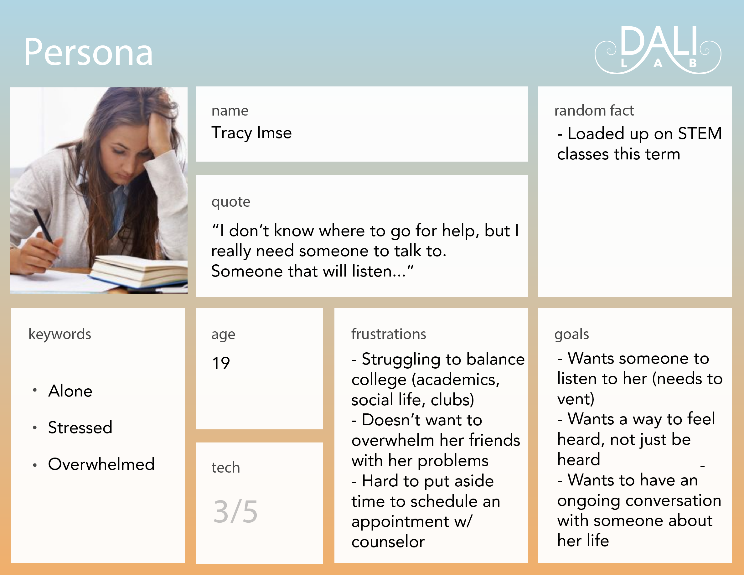
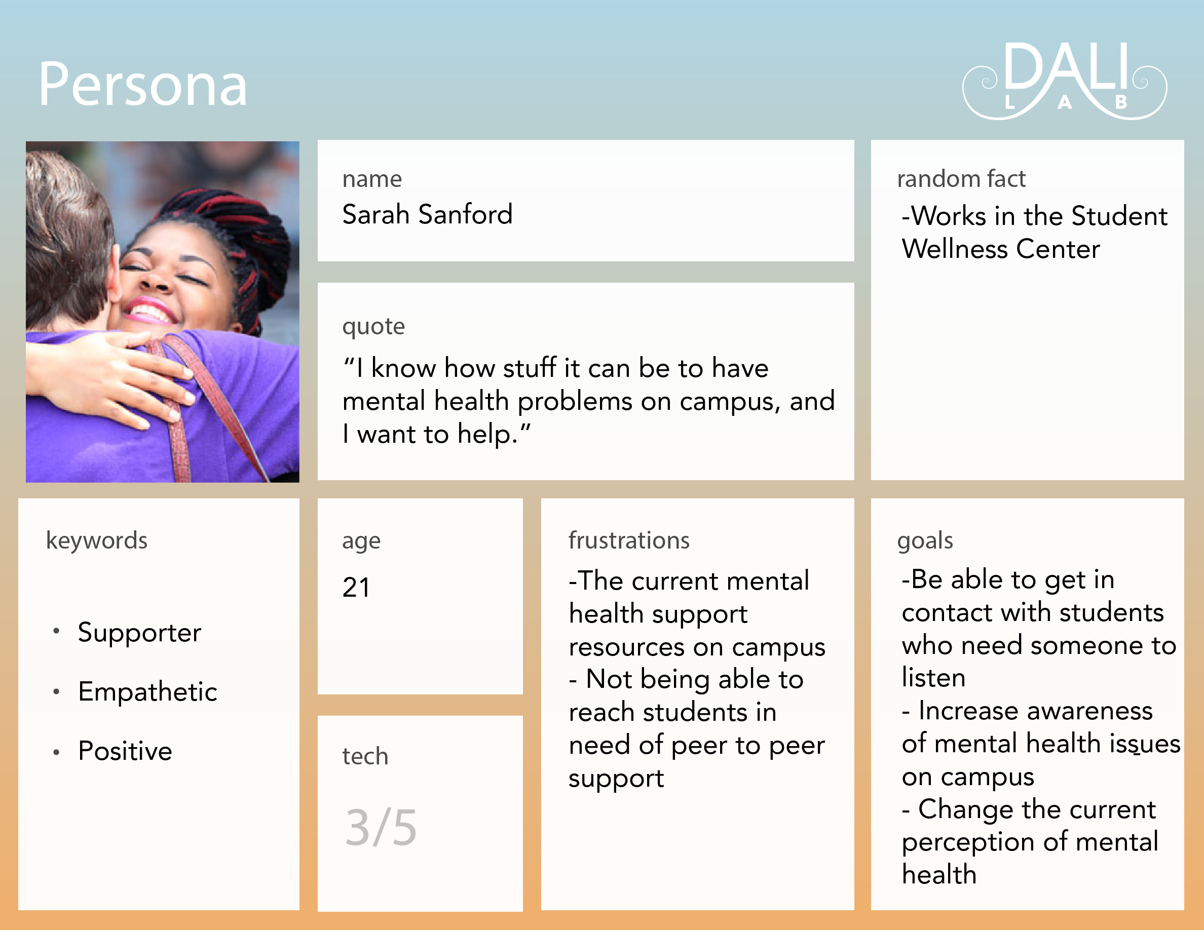
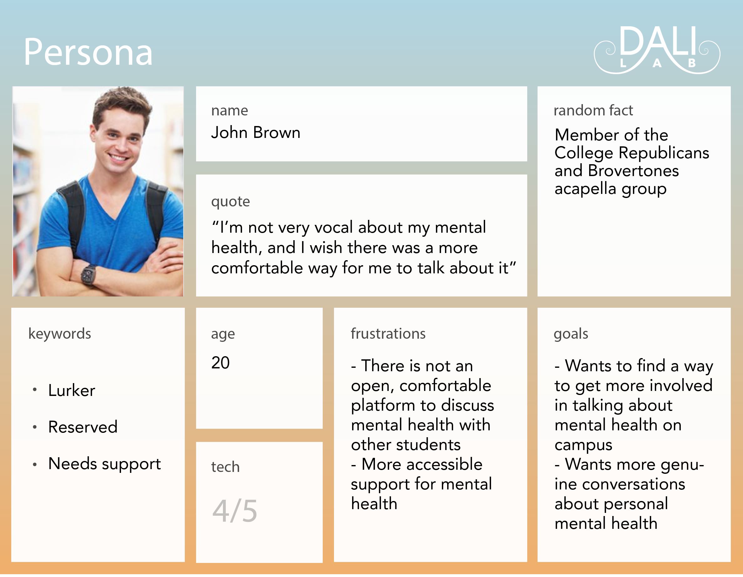
These 15 users also fueled a set of personas, the main ones being the following:
Define
From our interviews, we identified these key functionalities:
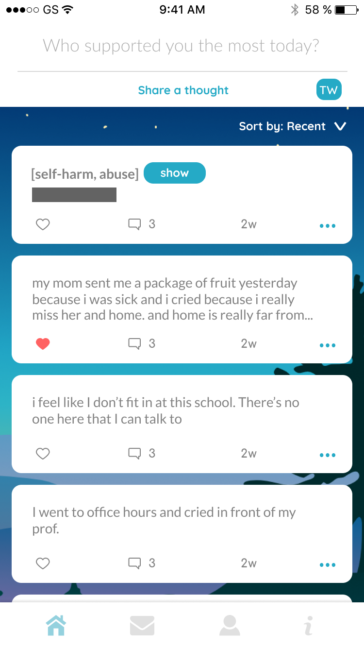
- To build a community amongst users, we will create a mechanism for sorting and liking posts. People should share support with other users without feeling like they need validation.
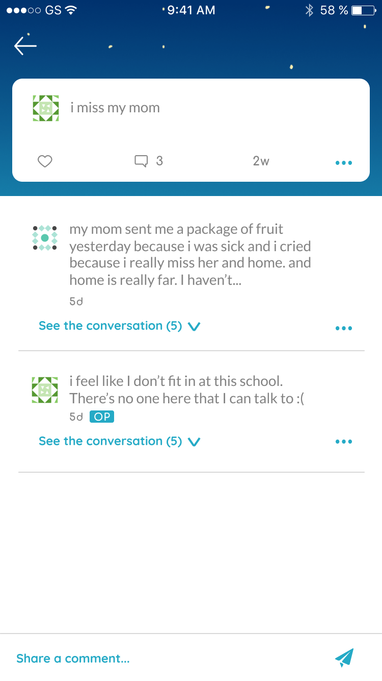
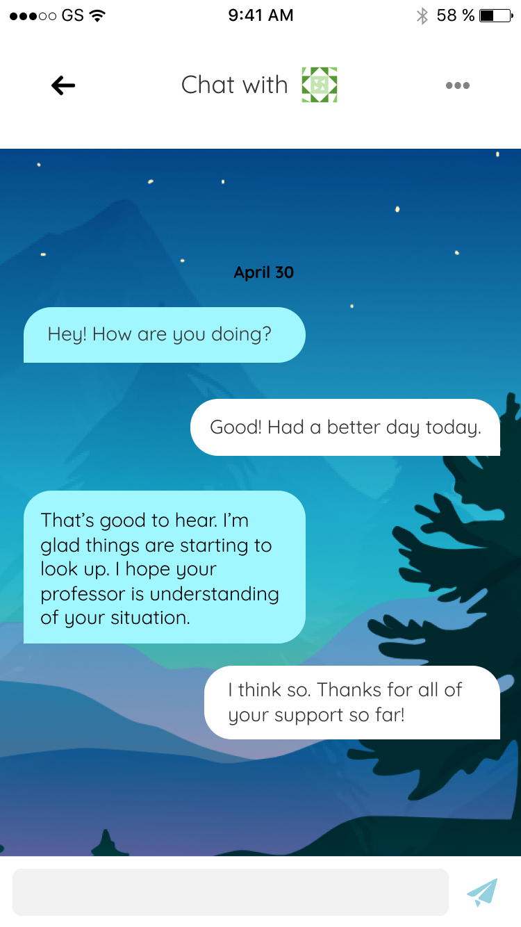
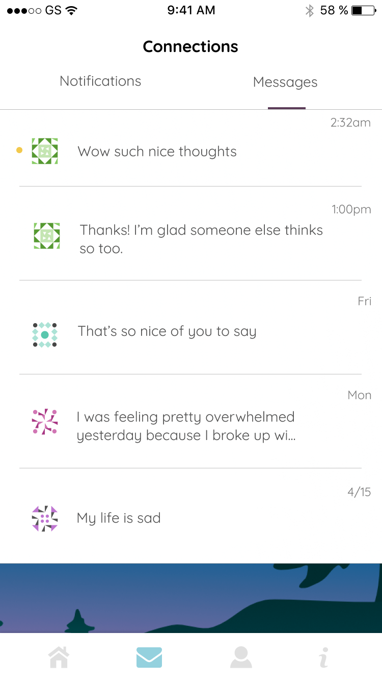
- In the same vein, students need an effective way to have conversations with each other on the app.
- The overall "feel" of the app should calm users. It should also gently encourage them to break out of their shell and make less-than-glamorous posts to combat duck syndrome.
- Students also worry about privacy, so we will create a system to anonymize users while also allowing them to chat with each other.
- Unmasked should be safe, so we need to implement a "moderator" system that can ensure posts do not threaten harm to any user.
- The app should be delightful and fun to use.
Ideating and Prototyping
Showing Support
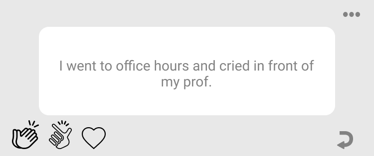
Our first idea was to have different types of support: clapping, snapping, and "hearting". This would reflect the different emotions someone could have towards a post, since giving a thumbs up to a serious post about mental health did not seem appropriate. We received feedback that the icons were not intuitive to everyone, so our second iteration just had a heart option, as it seemed to best encompass the message of "I support you" to the original poster. Our third round of designs included the ability for users to give multiple reactions to a post, much like Medium articles, so that we can get a better sense of more thought-out posts to sort to the top of the home page.
Throughout the process, we always wanted the number of reactions a post received to remain anonymous. This is in direct response to our key insight that students may stress about the popularity of their posts.
Calm Ambiance
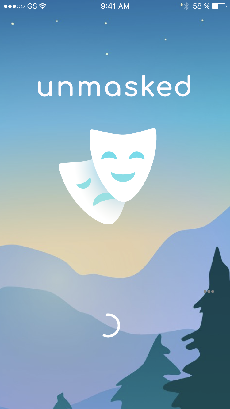
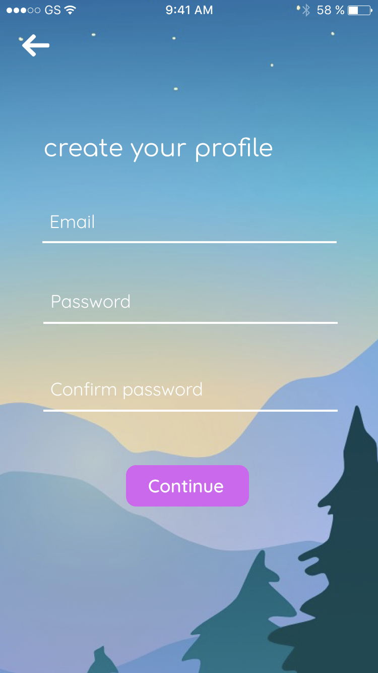
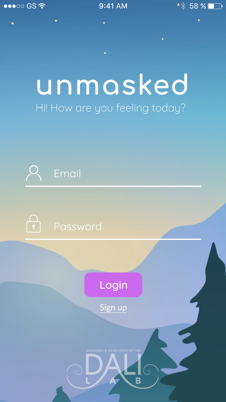
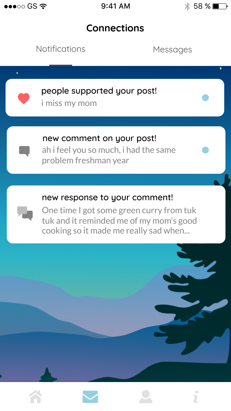
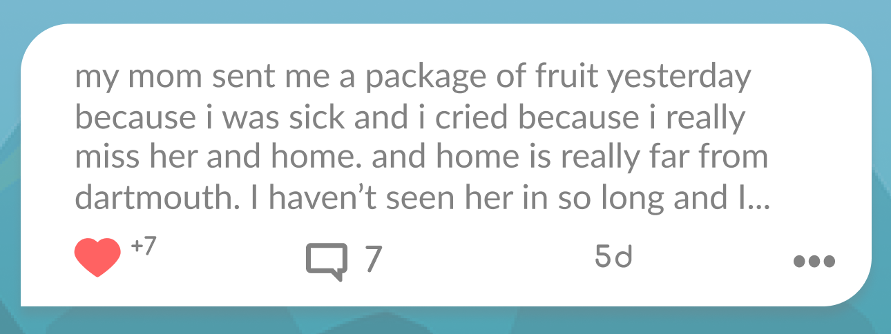
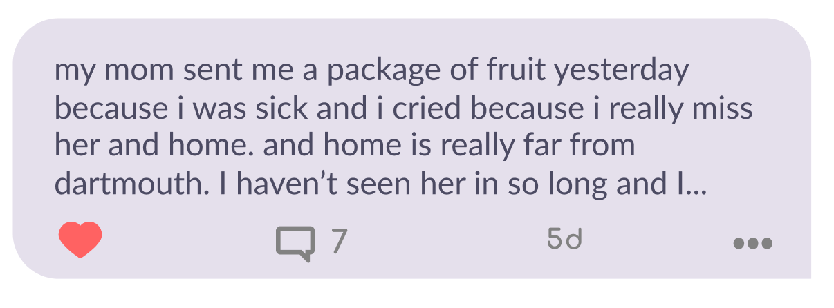
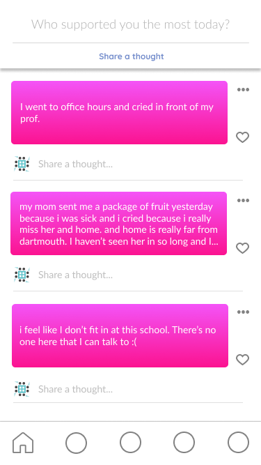
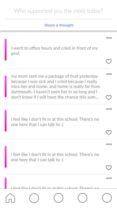
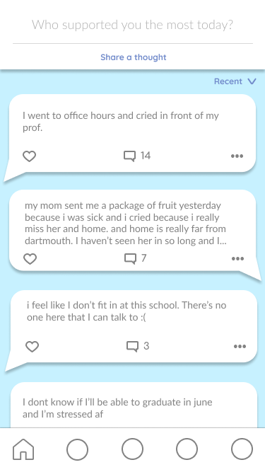
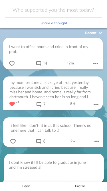
Our interviewees indicated that social media seemed to encourage people to present their best selves while hiding their struggles. We wanted to flip this narrative for social media and instead present Unmasked as a soothing and welcoming environment. Take our home page as an example, in which we changed our designs based on user feedback in what made them feel most comfortable: round letters, muted colors, outdoors imagery, and smooth shapes.
Identicons
We needed to balance the following needs: anonymity and community-building. We eventually found "Identicons", a function that creates an avatar based on a unique hash value. To create an identicon, users input their own string as a hash value in lieu of making a username. Creating usernames could allow inappropriate names and easily-identifiable users. It also emulates social media platforms that pressure students to present their perfect selves – something as simple as selecting a username could plant the idea that users need to represent themselves in the name, and we want everyone to feel as if they are equally a part of the Unmasked community.
Moderator View
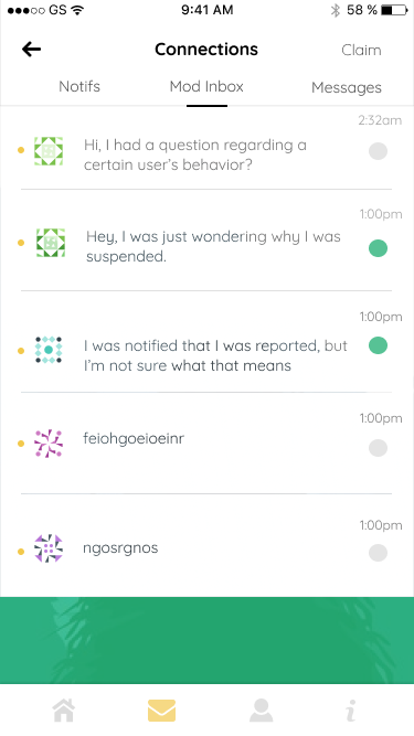
Moderators are student volunteers chosen by the Unmasked team who look through reported content. Users can report inappropriate posts or chats to moderators. The following is a moderator view of an attached reported chat. They can suspend or ban the reported user or turn over this information to Safety and Security at Dartmouth if the post had threatened harm toward any students.
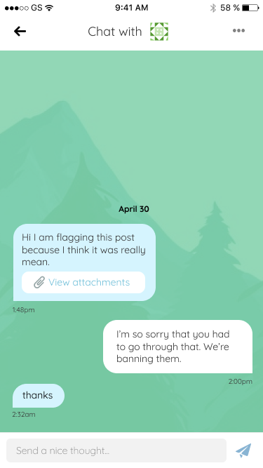
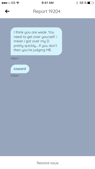
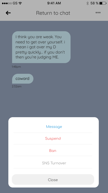
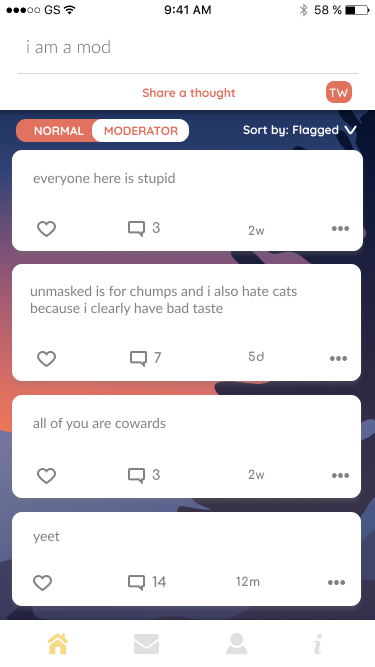
To claim messages and posts, moderators also have a moderator's homepage and message box for spam, inappropriate messages, and questions regarding moderation. We designed this method of claiming messages so that each moderator can have access to all moderator content.
Trigger Warnings
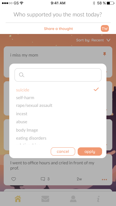
Some of the content in Unmasked may be triggering to our users, so we wanted to give students agency over what posts they wanted to view. Users are expected to attach trigger warnings to their posts.
Logo
Lastly, we designed the logo based on what we learned from our users: use mellow colors, outdoors imagery, and rounded edges to convey calmness.
After experimenting with more vibrant color palettes and styles, I created some assets for Unmasked. I made morning, evening, and night versions of each asset, because I wanted to let users experience as much beauty as I could within our UI. Use the slider below to see the differences between our morning and sunset backgrounds:


Final Product
Here are our final designs, as well as a link to the app! Unmasked as gone through a few iterations since, but the team still uses my design, Mira and my design guide, and Justin, Eric, and my user flows.
My Takeaways/Learnings
I was able to elevate my Figma skills
I created all graphic assets & became more of an expert in Illustrator
I learned how to iterate between three designers at once
I interviewed a dozen people in a week
UI makes a huge difference in how people perceive an application, and thus heavily affects UX
10 Weeks to do launch one application?! We worked fast
Connect with me!
If you're a student who wants to know more about product design, a small team looking for a freelancer, or just another poodle-owner, hit me up on Linkedin or shoot me an email at theia.y.qu@gmail.com.
