Helping people save – while having a good time!
 Mobile app.
  Product Design
  Interaction Design.
Only 40% of Americans have $400 available in case of an emergency. At the same time, Americans spend $71 billion – $285 per adult – on the lottery every year, and only 50% of what's put into it is paid out. And that's only to the handful who win.
The Yotta team tackles this dichotomy by offering a high-yield savings account that pays out additional weekly prizes; the more a user saves, the more tickets they get into this drawing. I take ownership over much of the product design, graphics, communication visuals, social media, and website, sharing this responsibilty with the Director of Design and Engineering.
Because I work on so many features every quarter, I've summarized only a few of my favorites into short highlights of my work. They'll be organized into the following steps:
PROBLEM & SPEC
RESEARCH
PLANNING
FINAL DESIGNS
IMPACT
Transaction Allocation
PROBLEM
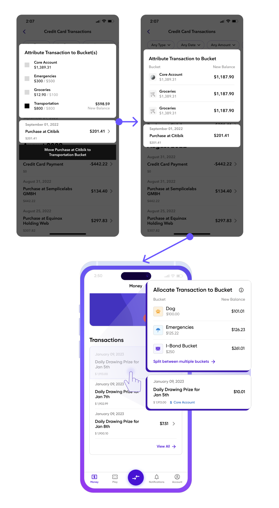
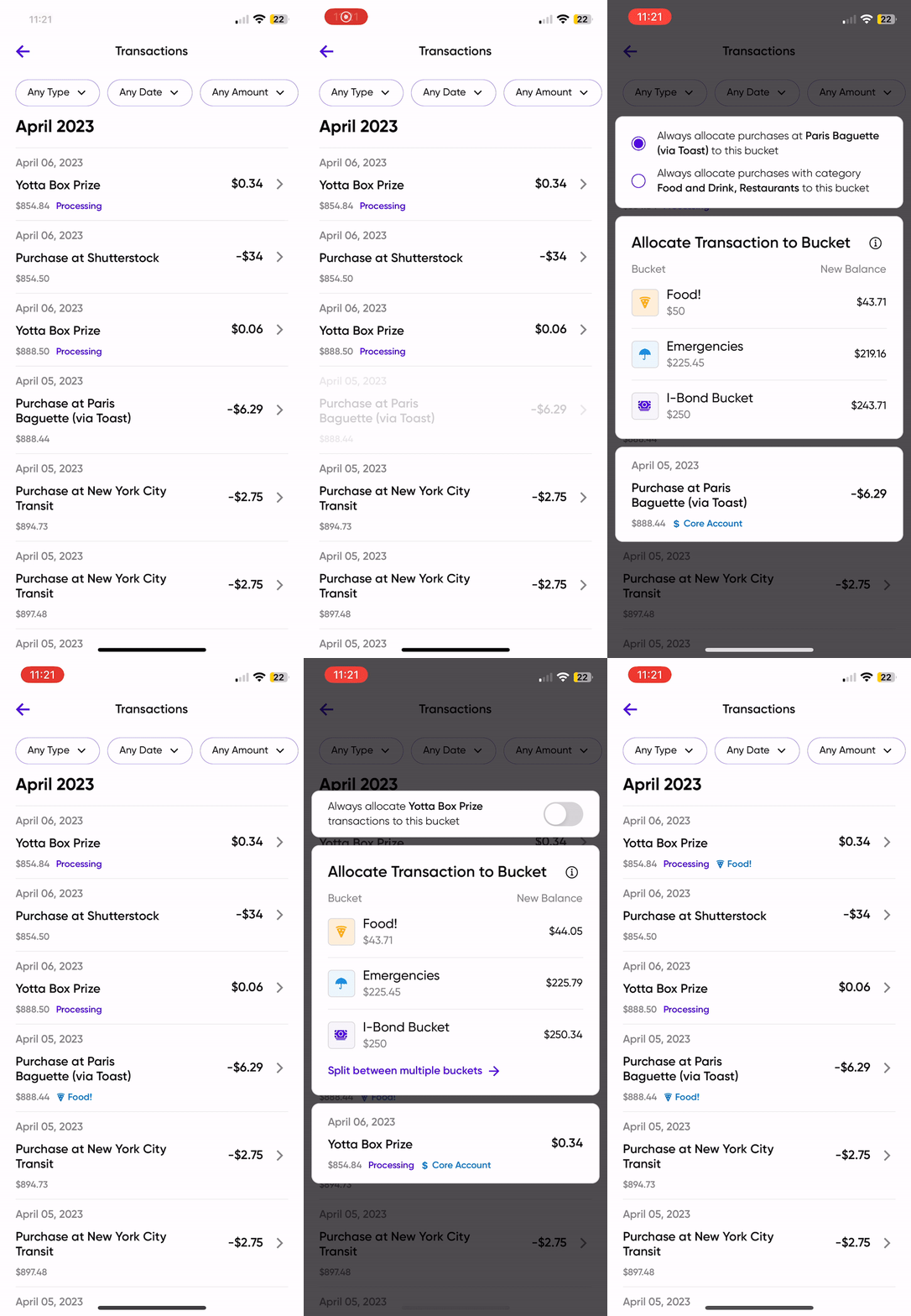
We offer users almost unlimited buckets to organize their saving and spending habits. As users deposit, withdraw, and use their debit or credit cards, they find it irksome to manually transfer funds between buckets. We introduced a transaction allocation feature that lets users easily attribute their transactions to buckets.
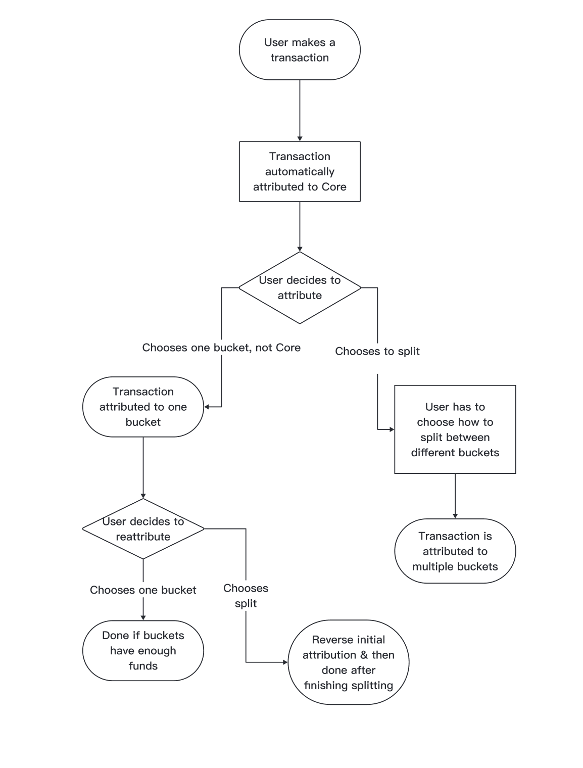
RESEARCH When looking into how big banks allow users to organize their transactions, I found that allocations were essentially mini transfers that didn't really save users time in organizing their spending and saving. Moreover, the closest feature I could find to splitting up a transaction was a paycheck splitter. I carefully explored different user flows for interacting with a transaction splitter.
PLANNING I was excited to dive into this project because I wanted to explore succinct and delightful interactions. I suggested that our allocation action popup should appear when a user uses 3D touch or a long press on their mobile phones. I also explored swiping, but found that swiping created an extra step and users felt like they were deleting a transaction or going to a separate page. The following shows this feature's main page's journey from greyscale to high fidelity to final product.
FINAL DESIGNS This feature was actually much more complicated than I'm describing right now – we had to implement credit card allocation payments, different ways to split transactions by percentage and discrete numbers, and allocation rules. I've fleshed out pages to view and edit allocation rules, and the following clip does not fully follow my original UX. For now, we are just observing how users interact with this feature before we reach our final design goals.
IMPACT
This feature sees good engagement, and we've received positive feedback in our WhatsApp testing group and subreddit.
Ticket Breakdown
PROBLEM
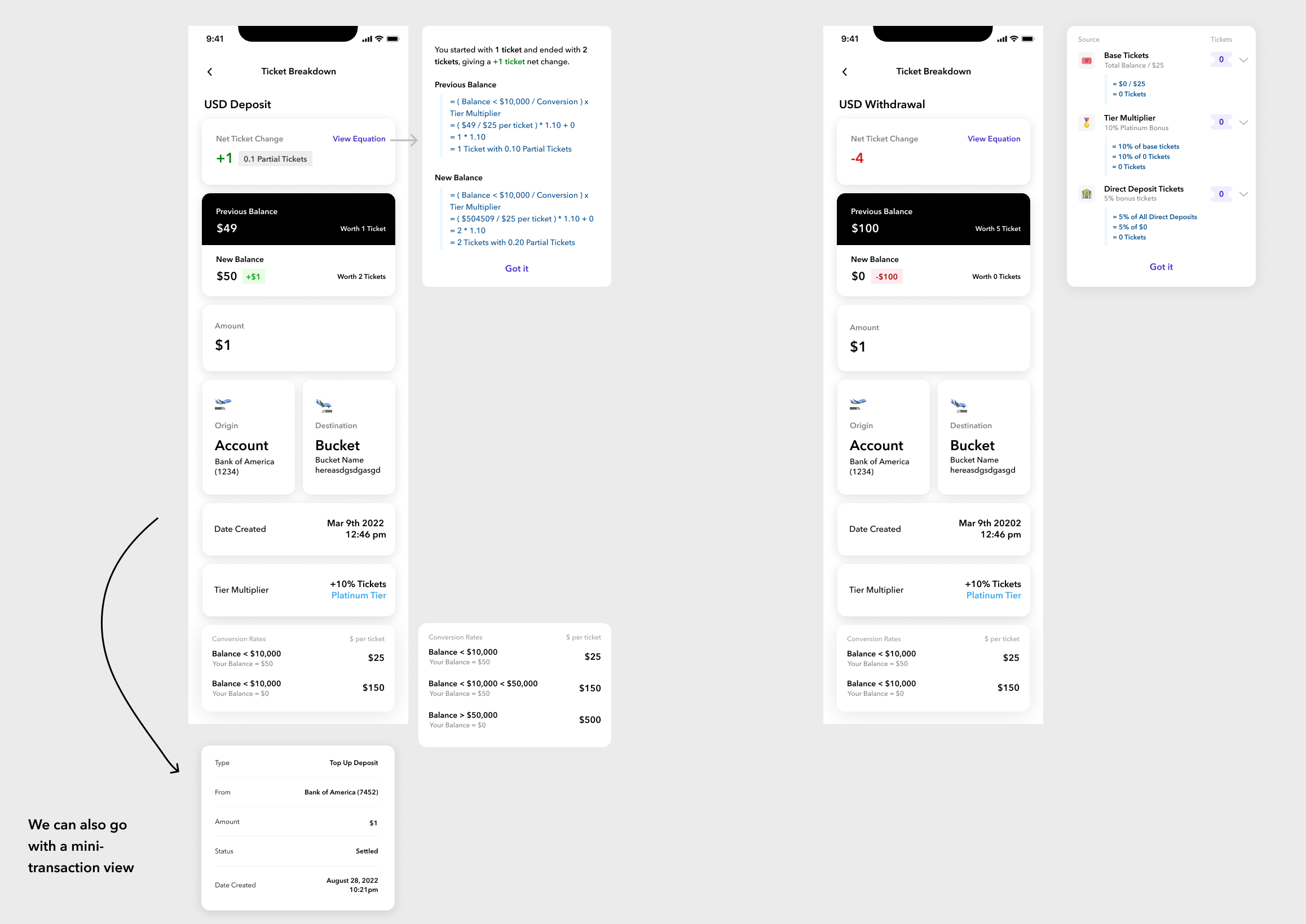
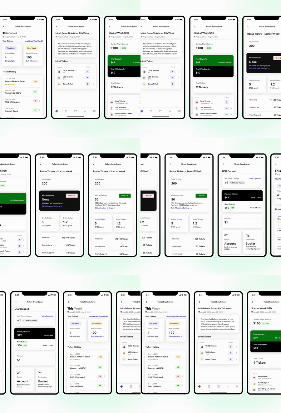
The system in which users receive sweepstakes tickets is complicated, and our support team receives a ton of questions regarding where a user's tickets came from. Currently, users receive one ticket for every $25 they have in our savings account, but there are countless ways to get bonus tickets throughout the week; figuring out a user's weekly ticket number has now become a mathematical equation fit for a high-level arithmetic course. This features breaks down the origin's of a user's tickets every week in a concise and delightful way.
PLANNING The most notable step within wireframing was figuring out how to display 3 parts of the data: first, certain actions yielded tickets in the current week, but others yielded tickets in the following week. Second, there were so many variables in the final ticket count equation that we needed a simple way to show a mathematical equation. Third, the flow itself had to be minimal – three clicks at the most, to prevent users from getting lost – but still had to show all of this nested data.
IMPACT
Our support team has noticed a dramatic decrease in cases about ticket origins, and we've received a few emails from happy users who feel like this system has been demystified for them.
I-Bonds
PROBLEM
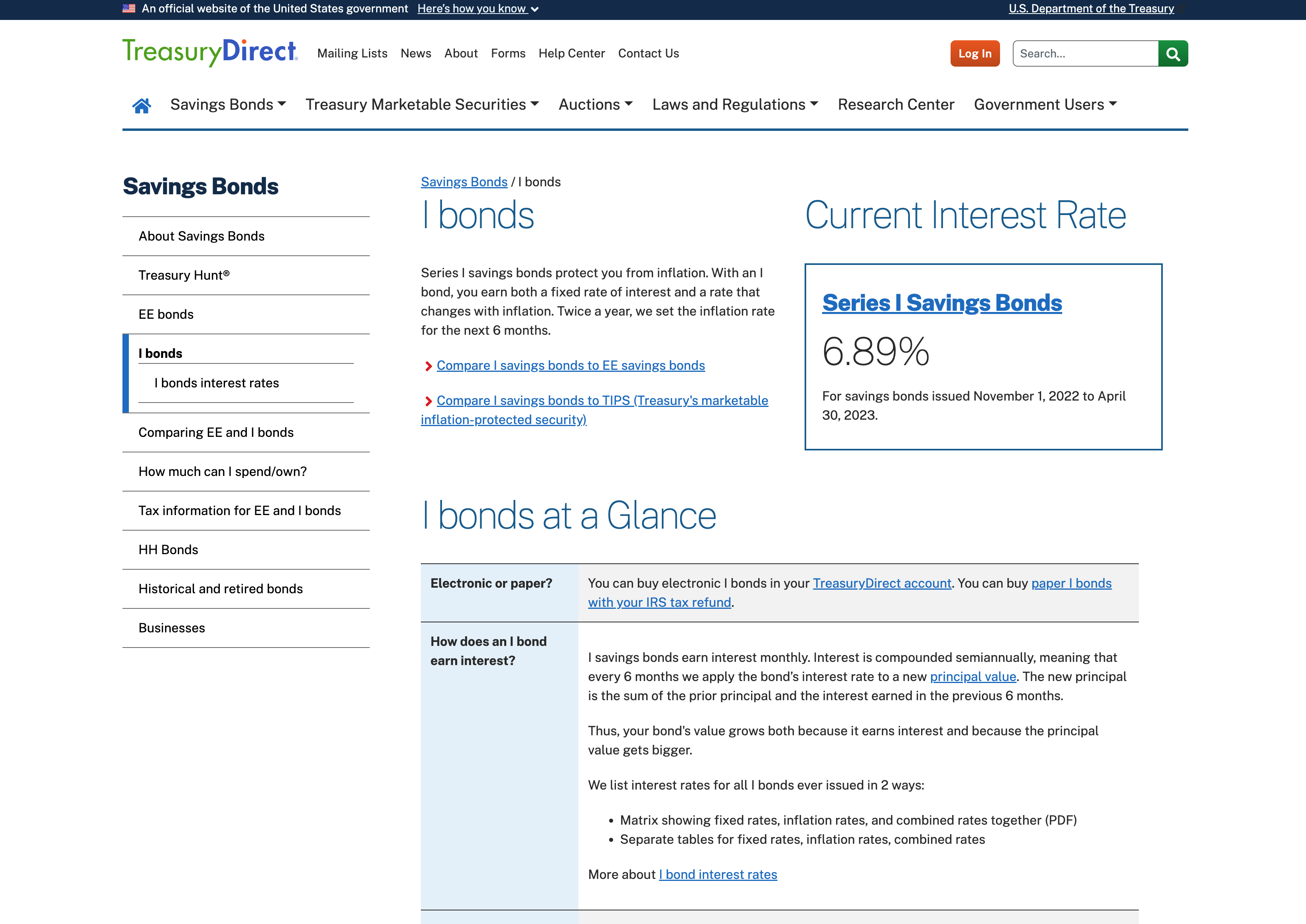
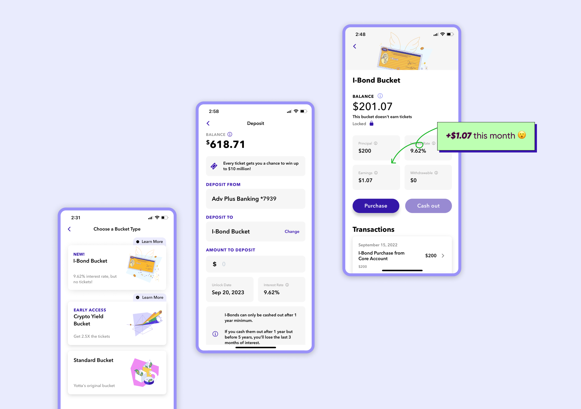
TreasuryDirect.gov is an archaic website and the only place where someone can purchase I-Bonds. This summer, I-Bonds had an interest rate of 9.62% and were the best way to accessibly invest money... except they weren't; I-Bonds aren't common knowledge even amongst the financially conscious, and those who are aware of them are blocked by the Treasury Direct purchasing experience, which can last hours (if you can figure out how to use the page). In accordance to its original goal to help the average American save, Yotta added an I-Bond purchasing feature within the app that would allow any Yotta user to purchase up to $10,000 in I-Bonds within seconds, for free.
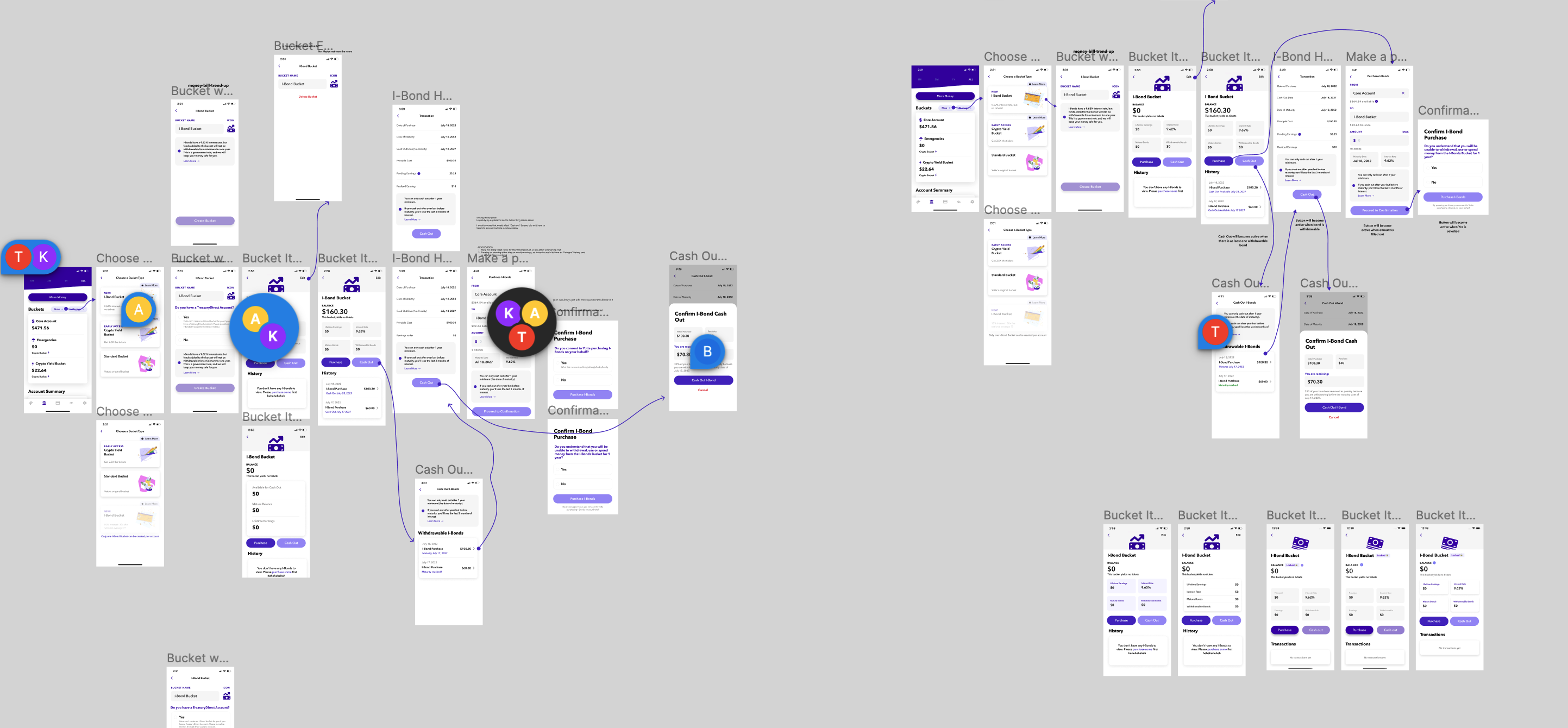
PLANNING Especially for people who aren't familiar with long-term investing, I-Bonds can be scary because they will remain locked for one year before one can cash out their bonds. Moreover, if bonds are cashed out before a 30-year maturity period is up, that investor will lose their last 3 months of interest. It became imperative that our designs make I-Bonds accesible and easy-to-purchase, but at the same time illustrate the significance of a long-term investment.
FINAL DESIGNS I finished designing our final flow within a few days, and I worked with a developer to figure out final tweaks in another few days. At the same time, I worked on creating emails, webpages, and social media content that would help spread the word about our new feature. The I-Bond launch took the most of one week, and it gave our users plently of time to purchase them before the interest rate changed a month and a half later.
IMPACT
Our users purchased over $10 million in I-Bonds, and our product was featured in Bloomberg for its accessibility and simple user experience.
My Takeaways/Learnings
This job takes a ton of independence and self-guidance, and I've made great strides in feeling confident as the only product designer
I can juggle multiple features at once and manage simultaneous conversations with up to 4 developers
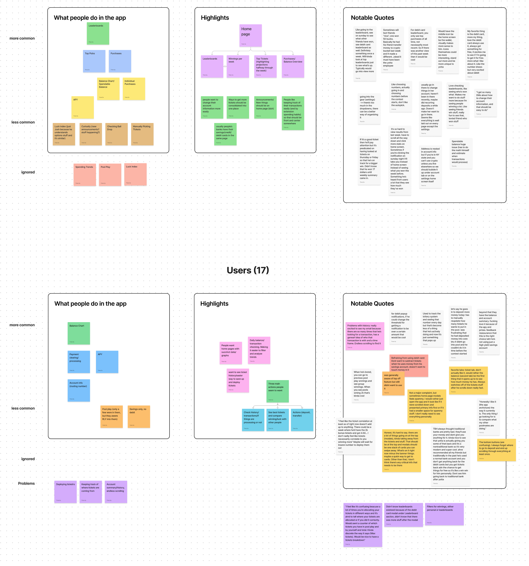
I'm very comfortable with rounds of interviews and use objective (surveys, statistics) and subjective data to inform my decisions
Design doesn't begin and end in the app; I also have more webapp, social media, and communications design experience under my belt
